

Whether you’re selling products or sharing some information, the banner of your blog is one of the most important elements of your blog post.
It’s the first thing that your visitors see when they land on your blog. It can make or break your impression and influence your click-through rate and conversions!
But how do you design a blog banner that looks professional and appealing?
Do you need to be a designer for that or spend hours on it?
Not at all!
In this article, we will show you how to design a blog banner in 3 minutes or maybe even less.
Your website blog banner’s information or message is as important as its design.
So, make sure the content you put on your banner is to the point and precise and the message it conveys is short and generalized so that it can evoke curiosity in the viewers and make them inquire more by clicking on the banner.

Think you lack the creativity to craft content that can best present your message? Well, there are so many AI tools you can use to get a killer banner title in seconds.
You must have already heard about ChatGPT which can help you quickly get some banner content for free. But that’s not it, there’s more! Copy.ai, Jasper.ai, and Anyword are some of the popular AI tools you can use to generate banner copy.
Related Read: 11 Applications Of ChatGPT Bot That Will Make You Say Ooh-La-La
The background of your banner is the first thing visitors will see when coming to your blog.
So select a background color or image that aligns with your message and grabs attention.
You can use a solid color, a gradient, a pattern, or an image as your background that matches your blog theme and tone. Just make sure to keep it simple and avoid clutter.

Depending on the design tools you use, you may have access to different options and effects. For example, some tools may allow you to add filters, overlays, or shapes to your background.
You can also adjust your background’s brightness, contrast, and saturation to make it more appealing. The key is to choose a background for your blog banner that is not too busy or distracting but also not too bland.
Remember, you want your blog background to complement the text you plan to put on it and the graphics, not compete with them!
If you don’t want to do it manually, you can use readily available templates that work great if you want to save time and effort. Many online platforms offer free or paid templates that you can customize according to your needs. Some popular options are Canva, Crello, Adobe Spark, etc.
Templates can also inspire you to come up with new ideas for your blog banner. You can browse through different categories and see what catches your eye. You can also mix and match different elements from different templates to create a unique banner image.
Next comes choosing the right font and placing the text in a way that stands out and makes it easily readable.
For example, consider using contrasting colors for text and background for better visibility. You can use bold and legible fonts to display your message. Some great fonts for website banners can be Playfair Display, Veteran Typewriter, Open Sans Condensed, Quattrocento Sans, etc.
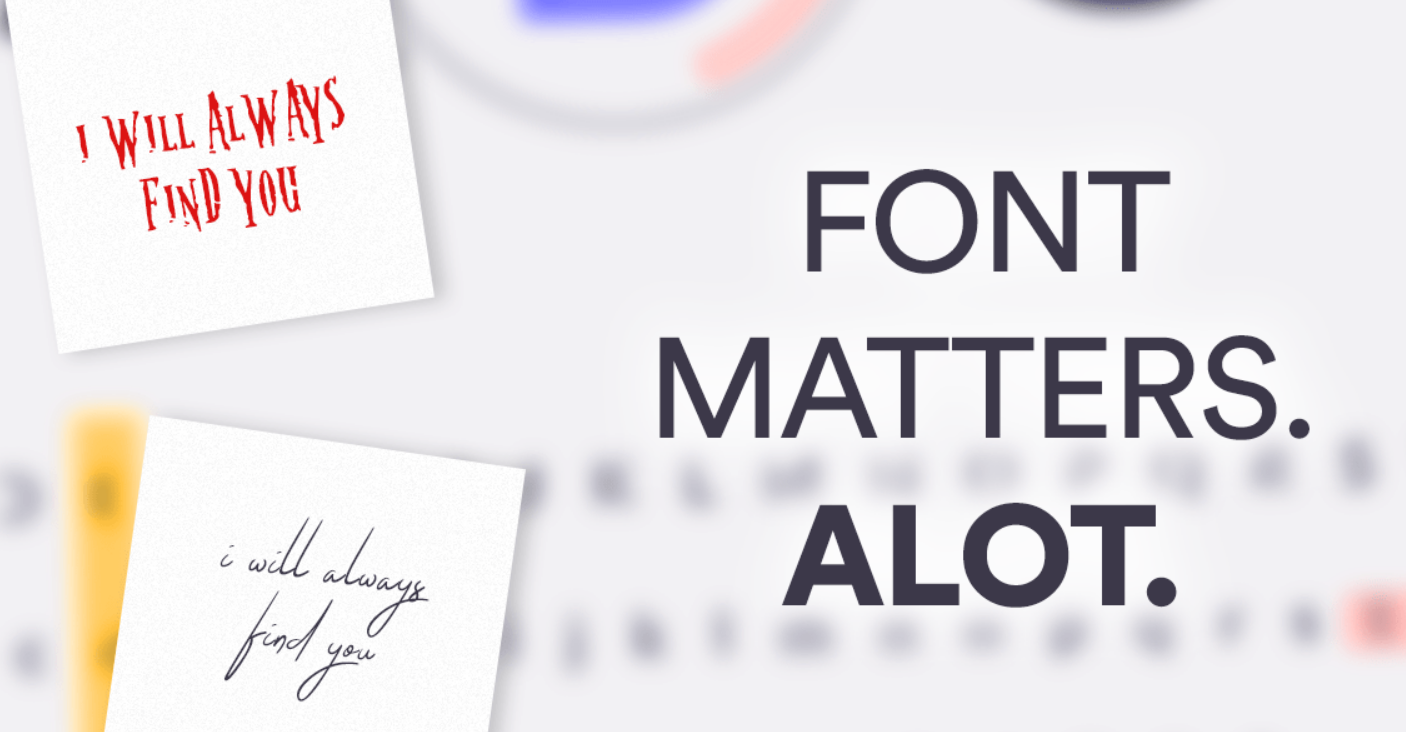
You can also browse more fonts on Google Fonts. Remember to avoid using too many fonts or styles that can make your banner look cluttered or confusing.
If applicable, include relevant visuals such as product images, event photos, or graphics that support your message or the content you are presenting on your banner. Ensure they are high quality and eye-catching.
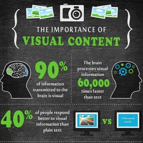
Some AI design tools offer a library of images and illustrations that you can search for and use. Select images that align with your message and resize or position them accordingly.
Are you designing the website banner for your business or organization?
Then you must ensure your blog banner image reflects your brand identity and personality.
Don’t forget to include the brand logo and any other branding elements you think will help you maintain consistency across your marketing materials.
Most AI design tools today allow you to upload and position your logo easily! Just keep the logo clear and visible and make sure it matches the color scheme and style of your blog banner.
Plus, if you want to include some design elements, such as icons, shapes, borders, buttons, etc., that you think can enhance your message and appeal, then this is the step where you do it! These can help you highlight your message, create contrast, or guide the viewer’s attention.
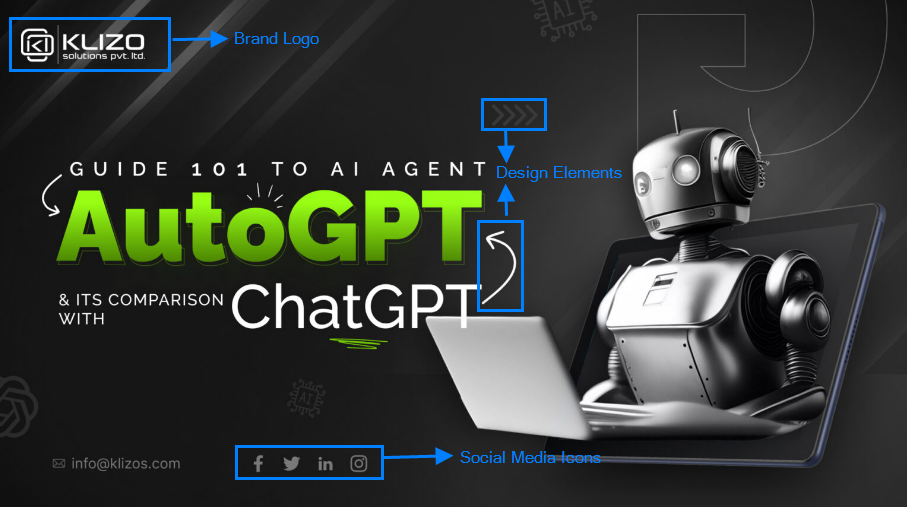
For example, you can use an icon to represent your blog topic, a shape to frame your text, a border to separate different sections, or a button to invite action.
However, be careful not to overdo it with the design elements. You don’t want your blog banner to look too busy or messy! Use only what is necessary and relevant, and keep it simple and elegant.
By incorporating branding and necessary design elements, you can create a blog banner that looks professional and also communicates your brand’s identity and personality.
Last, but not least, you must take a moment to review your design, ensuring that the text, visuals, and colors are cohesive and convey your message the way you want to. This is where make any necessary adjustments if required.
Before publishing, take a quick look at your blog banner and check if the text is legible and concise, the visuals are relevant and attractive, and the overall design is harmonious and balanced.

Remember, the final step is to make sure your blog banner is simple and clear. You don’t want to confuse or overwhelm your viewers with too much information or details. Stick to the essential elements that deliver your message efficiently.
So you see, designing a banner for your website can be fast and easy. You don’t need to spend hours creating a stunning banner image that attracts and converts.
Being a professional web development and web designing service provider, we know how challenging designing can be at times! But that should not be the case with your article banner.
With so many AI-powered tools at your disposal today, you can design a banner image in 3 minutes or maybe even less!
Just follow these simple steps and create a killer blog banner like a pro!
But what if you want to create more than just a blog banner? What if you want to design a website that looks professional and appealing and can boost conversions?
That’s where Klizo Solutions come in!
We are a team of experts who can help you with all your web development and web designing needs. We can create custom websites that suit your brand identity and personality and optimize them for performance and user experience.
Whether you need a landing page, an e-commerce site, a portfolio, or anything else, we can help you create it.
We use the latest technologies and tools to ensure your website is fast, secure, and responsive.
So don’t settle for mediocre web designs! Contact us today, and let us help you create a website that stands out and gets results. Klizo Solutions is your one-stop solution for all your web development and web designing needs!
Previous article
Joey Ricard
Klizo Solutions was founded by Joseph Ricard, a serial entrepreneur from America who has spent over ten years working in India, developing innovative tech solutions, building good teams, and admirable processes. And today, he has a team of over 50 super-talented people with him and various high-level technologies developed in multiple frameworks to his credit.

Newsletter
Subscribe to our newsletter to get the latest tech updates.
Thanks for subscribing. We'll send the latest tech updates to your inbox.