

Error 404 pages are like those unwanted relatives that keep popping every now and then out of nowhere! Although this kind of situation is frustrating, we still have to deal with it. So, why not make it fun and exciting?
Oh no! Don’t get us wrong! We are not talking about your unwanted relatives. We cannot help you with them but with 404 error pages, we can.
404 error page situations are something that nobody wants to deal with- neither businesses nor consumers. No matter how much you try to create a perfect website and ensure it never goes down, it will! Someday it will and that, my friend, is the truth of life! Certain situations can arise anytime and error 404 is one of them. You have no option other than to accept the reality and deal with it in the most dexterous way possible.
404 error pages are normally very boring, dull, and unappealing. This unpleasant appearance just adds to our annoyance and frustration of coming across the error 404 pages. So, the least you can do is make these pages a tad-bit more fun and humorous.
Well, that might not solve the error instantly but it will give your visitors a good laugh and act as a stress-relief too. Well, there are many such examples of some smartass, quirky 404 error pages that will surely make you laugh.

Well, building an Error 404 page is definitely not something that would be on your mind. You might ask what will you get by pouring your valuable time into creating an error 404 page? Creating a custom error 404 page needs considerable technical hackles and effort. It is needed to edit the .htaccess file and run a couple of commands on the server. Of course, this requires money and time so what are the benefits?
Let us have a look.
Money is definitely a huge factor for businesses but not all the time. Sometimes, you just need to put your selfish needs away and focus on making your consumers happy. It does not have to be through product sales only all the time.
Imagine how you feel if, at the end of a tiring day, you want to get something from your favorite brand and go to their website only to be greeted by an error 404 message! Annoying, isn’t it?
But, imagine the same situation with the only changed scenario where the error page is now made up of puppies playing or looking at you from the screen. That made you smile, right? You close the laptop, think about coming back again the next morning and go to sleep happily. That’s exactly what a fun, quirky custom error 404 pages does for your consumers.
Those few seconds of fun can eradicate the entire day’s stress and make people laugh. Not only that but it also ensures that they will come back when the website is up and working again.
When people come across a normal 404 error page, they usually find it annoying and hit the back button. Boring and dull pages just add to their grey lives and make it extra annoying.
However, with unique and funky 404 error pages, you can actually attract and increase the traffic of your website by a lot. Fustian error pages shoo away your traffic to a faraway land that might never return and a hip one will get back all this traffic while ensuring that they stay on the website.
You can also add hyperlinks to your most raging article, content, or your homepage. How much detail you want to add on the 404 error page is totally your decision but if you want some tips, then the homepage is a good option. Just because your tinder date stood you up, doesn’t mean you will let go of your potential customers! They are the ones who will stay by your side if you treat them nicely.
This is also a great opportunity to brag about your brand and flaunt your efficiency and creativity. You can show off your wit by creating stunning, kickass 404 error pages. It doesn’t have to be too overwhelming or crowded.
Okay, here’s an idea. If you run a food business or restaurant, then you can try creating something along the lines of “a character trying to crack eggs in a pan but the yolk spilled all over and the character looks confused”. This is a great idea of showing that an unexpected error just happened. It will also assure your customers that your brand is adept and full of qualified people.
These are three major reasons why you should build a fancy error page.
Now, let us see some brilliant examples of smashing 404 error page designs.
The idea of fun 404 error pages is not new and quite a lot of companies have already incorporated it into their websites. Here are some out-of-the-box examples of error 404 pages.

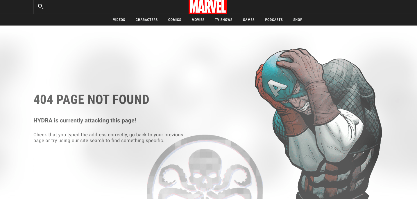
The most famous example of kickass error 404 pages are those of Marvels. They have several versions of their 404 error pages and all of them are based on the MCU characters. This sounds kinda fun, right? Check which character you get by clicking here.
Pixar did a very good job with its 404 error page. It depicts the perfect emotion of a user landing upon the error 404 messages with the famous animated character of Pixar’s Inside Out. Sadness is represented in such a cute way, Awww!!!
Disney has also swayed over everyone with its outstanding 404-page design by showcasing one of the most famous destructive characters- Wreck-it-Ralph. Not only that, but it also highlights KnowsMore, another supporting character of the movie “Ralph Breaks the Internet”.
These characters are the perfect fit for the error 404 situations.
We should also give it to Disney for adding the tiny search bar next to KnowsMore cleverly.

Image Source: HubSpot
Spotify launches a microsite every year to honor the most acknowledged music of that year. Although, it is a microsite the developers did a stunning job with the error page which is a salvo to Justin Bieber’s song- Sorry!
This is both fitting and funny.

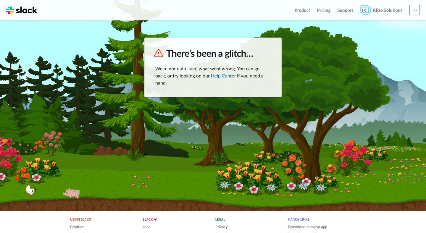
This is by far my most favorite error 404 page. Slack did an amazing job in curating this which shows a green scenery with butterflies, pigs, chickens, etc and the page goes black and white if you switch the tab.
404 error pages can create a significant impact on your business when created with creative intelligence. It can fetch a lot of traffic instead of driving them.
But, you need to be careful at the same time too. This is a professional ground and even though spicing things up nowadays is a huge business trend, you need to do it appropriately. Going overboard can actually cause a lot of harm.
For that, you can drop us a text at Klizo Solutions for genius and funky design ideas.
Hope you enjoyed reading this and found some insightful tips from it as well.
Previous article
Joey Ricard
Klizo Solutions was founded by Joseph Ricard, a serial entrepreneur from America who has spent over ten years working in India, developing innovative tech solutions, building good teams, and admirable processes. And today, he has a team of over 50 super-talented people with him and various high-level technologies developed in multiple frameworks to his credit.

Newsletter
Subscribe to our newsletter to get the latest tech updates.
Thanks for subscribing. We'll send the latest tech updates to your inbox.