

Dark-mode website design has been the talk of the Internet world for years now.
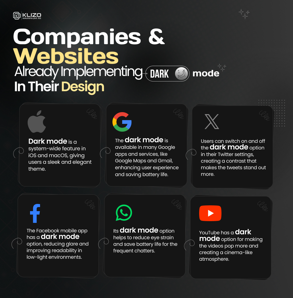
Over the past few years, dark mode website design has been one of the most requested web development features. Even Google and Apple have made dark themes a part of their UI.
From apps to mobile interfaces, more and more users are synchronizing their displays to a darker theme. Because of the recent popularity of the dark viewing mode, Google now offers the Night Eye feature letting users apply the dark mode on any website as long as they use Chrome as their browser.
The rapid increase in user preference towards dark themes has forced businesses to consider dark mode optimization when developing their app/web interfaces.
But do you think your website should, too, turn on the Dark Mode? If so, then why? This article, hopefully, answers all your questions.

Do you know that the majority of online users prefer the shift from light mode to dark theme or dark mode?
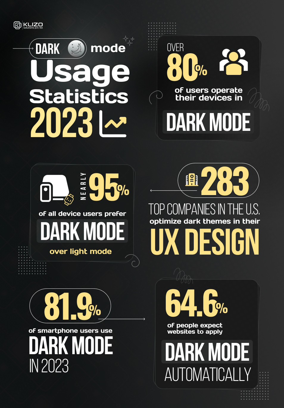
Ever wondered why do people like dark mode? What does dark mode offer that light mode does not? Then, continue reading as we will discuss the perks of the dark mode.
People these days are on their phones constantly. As per studies, the amount of scrolling an average person does in over 20 days equals climbing Mount Everest.
And as our daily screen time grows, our eyes need rest. Being on our phones very often and for long periods strains our eyes. But thanks to dark mode, seeing the screen in low lighting becomes easier, especially in the long run. Dark mode simply reduces eye strain.

Wait, there’s more!
Did you know that one out of three Americans has astigmatism, a common eye condition that makes it difficult to see clearly, especially when reading white text on a black background?
It is one reason many people prefer dark mode website design on their screens, as it can reduce eye strain and improve contrast.
The dark mode is also helpful for people with other visual impairments, such as cataracts or light sensitivity.
The dark mode gives users much more power over how long charges will last on their devices like laptops and smartphones. Dark mode saves battery and extends its life.
A study has shown that turning on the dark mode on AMOLED displays can reduce battery usage by up to 63%. Plus, turning on the dark mode on an iPhone can save a massive amount of battery life.

For example, an iPhone can play videos for 15 hours when users operate the iPhone in a lighter mode. However, in dark mode, the same device can play videos for 20 hours.
So you see, just by switching to dark mode, the battery life of iPhones can increase by almost 33%.
Implementing dark mode in a website allows you to experiment with different designs. You can play around with different colors, look side by side and determine the one that looks more appealing.
Do not confuse dark mode with just inverting white background to a black one, as it is a lot more than that!
Plus, dark mode website design is never one-solution-for-all as both developers and consumers prefer having the option to switch to dark mode. It creates more opportunities for you to test different dark mode concepts.
Dark themes in web designs have no negative impact on SEO. We know that the usability of a website and the user experience it offers to play a huge role in search engine rankings.
Hence, using dark mode comes with no such risks as Google penalties, as it does not yet influence SEO in any way.
So when exactly do you need to go with your “should my website be dark mode” thought confidently?
Dark mode website optimization works great for making visuals-based websites stand out. The dark and deep backgrounds serve as a perfect high-contrast backdrop for graphics, visuals, videos, and images.
The dark mode offers a website a solid visual hierarchy by making the lighter visual content stand out against the dark background.
Is your website/app designed to be used heavily during the nighttime? Then, dark mode can be the best option to make your website more user-friendly and boost its usability.
You can observe a high dark mode adoption rate in entertainment apps like Prime Video and Netflix for this reason only. Google Maps, too, automatically darkens during the nighttime.
A website needs to have more ’empty’ space To apply a dark theme. Otherwise, it will look cluttered. As a result, websites with dark modes evoke strong emotions compared to light ones.
And as per color psychology, dark colors like black are associated with power, drama, elegance, and mystery. So, a dark mode with a few high-contrast and large images guarantees a stunning result.
Dark mode website designs are in trend for years now. But still, there are times when you need to avoid dark mode. Yes, you heard us right. Dark mode may not work great for every project. Some of such scenarios are:
The dark mode is not any magic fix. Hence, it is a terrible choice for displaying web pages filled with text. Light text on a dark background makes it difficult to read.
On the contrary, dark text on a light background looks refined, clean, and crisp. So if your web interface contains loads of copies, dark mode is a strict no-no.
Dark-mode website themes limit color options. If your website has too many bright colors, it might clash when switched to dark mode, giving the site an unfriendly and harsh appearance.
Most of the colors you use on your website should be muted neutral colors as they go best with dark mode.
The dark theme makes a terrible choice for websites or apps with lots of small images, icons, and buttons. Dark backgrounds always de-accentuate the empty space making the web pages look cluttered, unprofessional, and unorganized.
Take dark mode website examples like Spotify, Saturday Night Live, The British Museum, Star Wars, CATS, etc., to understand when to make dark mode your ultimate web design mantra and when to avoid it!
Dark mode may not be the perfect solution for every product design. But for your website, it certainly might be!
And now that you know why dark mode should be your web design choice, at least make sure your consumers have the option to switch to dark mode when exploring your website.
Need experts and skilled professionals to optimize your existing site for dark mode website or develop a new stunning website with dark mode optimization? Then, we, Klizo Solutions, are just a call away!
After all, not everybody can pull off a dark theme successfully. The very factors that make dark themes so appealing for some can make it appalling for others.
At Klizo, we have a team of super-talented web developers and designers who know how to fine-tune the customer experience by crafting stunning website designs. Even with dark mode on, our team ensures your website looks attractive enough to make your users comfortable and curious at the same time.
Contact us now and give your online business an elegant and modern appearance today!
Joey Ricard
Klizo Solutions was founded by Joseph Ricard, a serial entrepreneur from America who has spent over ten years working in India, developing innovative tech solutions, building good teams, and admirable processes. And today, he has a team of over 50 super-talented people with him and various high-level technologies developed in multiple frameworks to his credit.

Newsletter
Subscribe to our newsletter to get the latest tech updates.
Thanks for subscribing. We'll send the latest tech updates to your inbox.