

Gone are the days when heavy content portals used to work! Today, interactive and dynamic web designs rule the online world where holding the users’ attention span is all that matters.
Given the constantly changing web design trends coming to the forefront, a static website is the last thing you will want for your business. A website is not just a digital representation of your business but the digital front door through which you attract, welcome, and convert visitors into paying customers.
And motion UI is one of the web development trends that can turn a boring UI of a website into fun! Yes, it is a super-effective way of creating an interactive, compelling and lively website interface.
Read on to know more about motion UI and why you must implement it in your web design in 2022!
Motion UI in web development enhances the outlook of websites and applications by enriching the user experience and offering emotional benefits like usability and aesthetic satisfaction. This particular art of using animation and movement helps communicate a sequence, a transition, a next step, etc., and guides the user experience. Extensively used as a solid branding tool, motion UI in web design reinforces interactions and visual cues specific to a particular brand.
Animated charts, background animations, page header transition, modular scrolling, hover effect – all these are examples of motion UI elements that work to boost interactive user engagement. Using this technology, web developers can represent data with colors, shapes and gradients, and other dynamic movements, which breathes life into an otherwise static web design. Motion UI enables seamless integration of animated elements in a web design to make the site grab the maximum attention of the users.

Everywhere you go, you will see businesses vying for attention. Being Seen, Getting Noticed – is what everything is about today. Then comes retaining the attention of the users – a more challenging task for businesses. But guess what! Motion UI designs on your website enable you to achieve both! Yes, more reasons for harnessing the power motion and movement on your website.
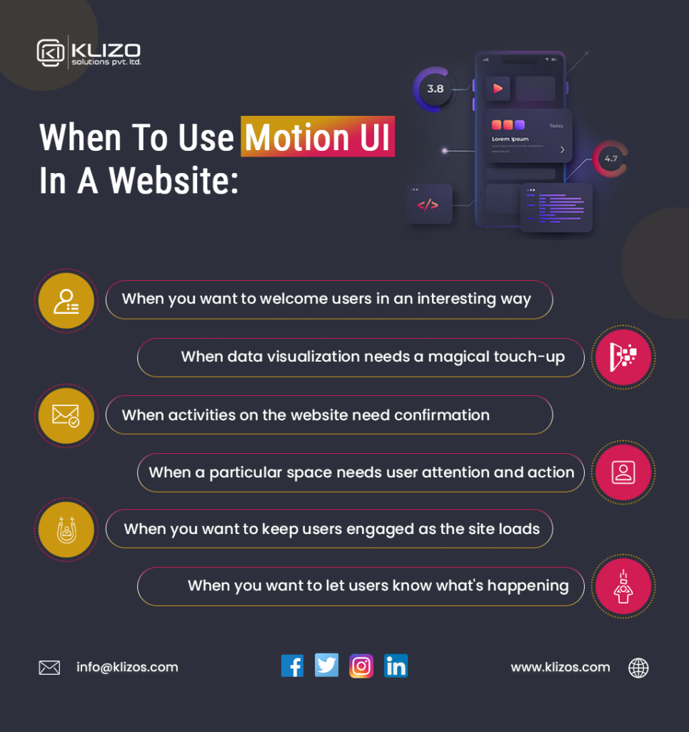
Do you want to welcome users to your website with an attractive greeting message? Well, you must! A captivating welcoming message leaves a positive impression on the users. And featuring motion graphics in UI design can further uplift the impact.
Who can forget the welcoming screen of Nokia mobiles where there was a logo of two hands meeting! Well, using motion in your welcoming message helps your brand stand out from your competitors and enhances the users’ experience with your site.
In case there is a time delay in loading your website, then, too, motion UI keeps the users engaged. It improves the web design not only by enhancing its appeal but also by helping you excitingly welcome your visitors.
Websites need users to take different actions. Making the users take some action is an essential part of any website. And motion UI can help educate the users about the ‘action’ they need to take and how to take them.
Especially when it comes to confirming irreversible activities like sending mail, deletion of mail, clicking on links, etc., UI UX motion design makes the action confirmation process attractive and ensures that users do not make any mistake in taking the actions. Using motion UI, you can lead the users’ eyes to the destination of the action you want them to take.
Does it annoy you when you visit a website and click on a sign-in or any other button but see no progress? Yes, we know, it does! And the same goes for your users, too.
Seeing no progress makes the users assume several things, like whether their internet is working fine or they clicked on the right button or not, etc. Sometimes, they even end up leaving the website. Take any motion UI examples and you will see that its presence in your web design prevents this from happening. Through motion UI, you can let your users know what is happening after the action they just took.
The loading time of a website or a web page or its refresh stage is the ultimate moment when most users are about to leave a site. Again, with motion UI, you can make the loading time good-looking, stylish, and of course, entertaining.

Movement detection is very natural to us as humans. So if you are wondering why use motion graphics, know that the motion UI elements (like bouncing charts or graphics) make the web design eye-catching and engage users for longer, a lot more than static images.
Using motion UI to guide the users’ eyes to the point you want them to pay more attention to your website is one of the best applications of it in web design. It not only increases the chance of users staying longer on your website but also helps with converting visitors into paying customers.
Plus, the bounce elements and velocity that motion UI includes complements the UX of your website and boosts its speed and progress. And we all know that the website conversion rate drops by 4.42% (on average) with each additional second of load time (within 0-5 seconds). So, you see, opting for motion UI indeed makes sense!
Adding the appropriate motion UI elements can breathe life into your website. It can reinforce your web design in such a way that it leaves a lasting impression. We all know that people prefer to look at an attractive website, stay on it longer, and tend to revisit it. Motion UI may not define your website but certainly enhances the user interface and boosts usability.
Users often find data and numbers boring and end up skipping that part. Yes, most users prefer not to strain their eyes reading out the boring numbers. But when you display the numbers and data with motion UI, you make the same boring thing look attractive. The different shapes, colors, and gradients make your website layout a treat to the eyes while delivering consistent branding.
Users love dynamic things more than static content on a website. And motion UI design can attract user attention and make their experience on your site an enjoyable one. Yes, fun elements like Slide, Zoom In, Zoom Out, parallax animation can confer liveliness to even the most boring website.
Will you like to explore a website with fun elements or one with none? Of course, you will opt for the one that offers a fun experience. And that is what motion UI does. It simply reboots users’ web experience and helps them understand the solutions mentioned on your website by showing them what happens next after a specific action.
Motion UI makes navigating through a website super easy and very much enjoyable. It encourages users to visit the website again and again. Plus, when navigation becomes easy, it boosts the reach of your website. The presence of motion UI elements like sliding, zooming in and out, etc., enhances the look of a website and its content, making it simple and more entertaining.

So you see, Motion UI in web development is no longer an option but a necessity to make your website provide the best user experience and leave a positive impression of your brand in the audience’s mind. A good UI is an essential part of a website that adds elegance.
Need help with introducing motion UI to your website? Then we, Klizo Solutions, are just one call away. We have a team of experienced and skilled web designers for creating innovative and outstanding user interfaces for websites. We also have numerous stellar websites to our credit that deliver the web experience of the future.
Reach out to us today to bestow a stunning look to the digital front of your business that your users will love!
Joey Ricard
Klizo Solutions was founded by Joseph Ricard, a serial entrepreneur from America who has spent over ten years working in India, developing innovative tech solutions, building good teams, and admirable processes. And today, he has a team of over 50 super-talented people with him and various high-level technologies developed in multiple frameworks to his credit.

Subscribe to our newsletter to get the latest tech updates.