

Have you ever had difficulties with closing the pop-up screens?
Or is it that you’re annoyed facing issues with canceling subscriptions or subscribing newsletters and can’t remember when or why you subscribed in the first place?
Then know that you have experienced UX dark patterns, a web designing trick to boost conversion or other business objectives.
Source: Medium
Every business wants to make money. While some give priority to the needs of the users along with pursuing their marketing objectives; some do not bother about building a customer-centric business culture at all. Yes, such businesses, to make more profit, opt for dark patterns in UX design.
Not familiar with what UX dark patterns are or how they work?
Well, dark patterns in UX are carefully designed misleading interfaces by UX design experts that trick the users into choosing paths that they didn’t probably want to take, thus fulfilling the business objectives, completely ignoring the requirements and ethics of users.
Source: KYLE GAWLEY
Just look at the image above. How the “smart” or you might say deceiving double negative copywriting that is! Usually, we all check off boxes when we need something extra. But here, we all now understood what just happened.
Most Common UX Dark Patterns to Trick Users
To know in detail about the dark patterns, let’s check out some of the most common dark pattern tricks in the UX design that mislead users. Probably you have already come across or experienced many of these.
Deliberate Misdirection
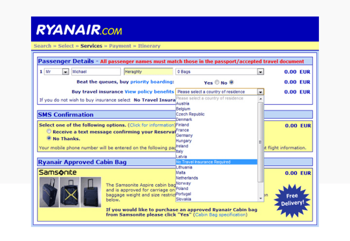
Source: UX Planet
Deliberate misleading or intentional misdirection patterns are those where the product creators intentionally guide users to options that result in the fulfillment of a company’s business values. This is one of the many types of dark patterns that helps companies earn quick money but ruins the user trust.
Example:
One of the most common examples of deliberate misdirection is ticket booking on Ryanair Airlines. Here when buying a ticket users are directed to purchase travel insurance. But on clicking the travel insurance dropdown menu they get a list of Countries of Residence. The option to opt-out from purchasing the travel insurance is at the bottom of the list.
The trick here is that instead of buying travel insurance or opting out from it, users eventually end up telling their country of residence, as the dropdown menu makes it look like there’s no option to deselect the country of residence.
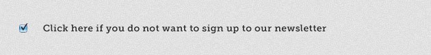
Confirmshaming
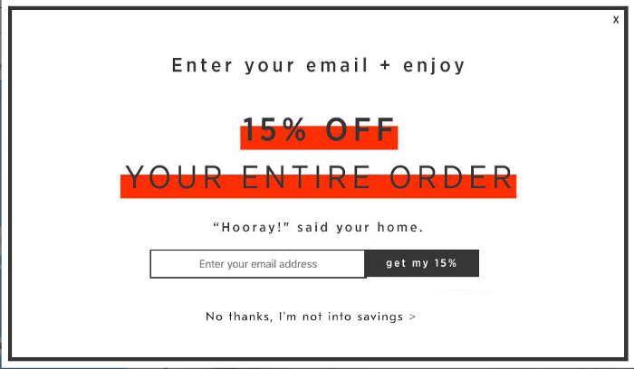
Source: Medium
Another one of the popular dark patterns misdirection is confirmshaming. Here the users are made to opt for options by shaming them if they opt otherwise. This pattern is mainly used to make users sign up/register for a mailing list.
Here, users see a pop-up where there are two options; one is a call to action, usually in bold color; and the second is in a more subtle color shaming the users for not clicking on the first ‘right’ option!

Source: Tumblr
Example:
Some of the examples of how shaming options look like are: ‘No thanks, I’m not into saving’, ‘’No thanks, I’d rather not keep up-to-date, ‘I don’t care about kids’ health’, ‘I’m not interested in getting more knowledge’ etc.
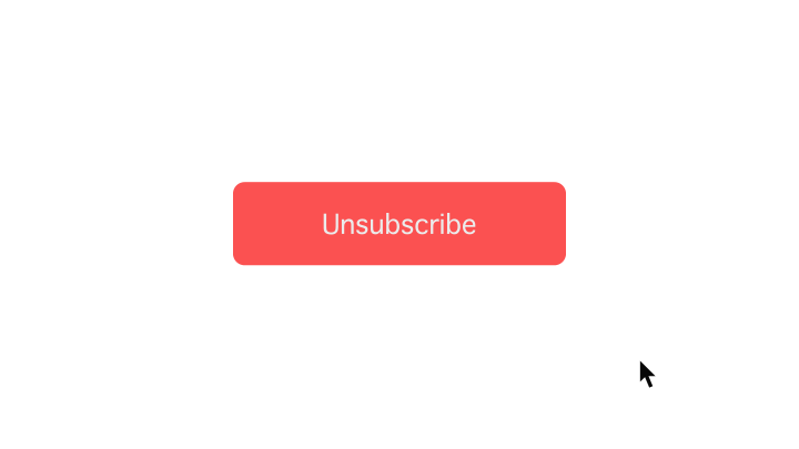
Invisible Unsubscribe
Ever looked for the ‘Unsubscribe’ option in the emails but unable to find one?
Well, credit for this confusion goes to the invisible unsubscribe designs, one of the worst types of dark patterns. These are sneaky tactics where the ‘Unsubscribe’ option is greyed out or made kind of invisible in a way that users believe that there is no option to unsubscribe.
Source: Tumblr
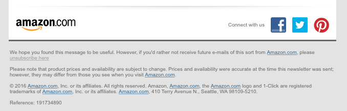
Well played, Amazon!
Example:
While most companies try to keep the unsubscribing process simple, Amazon is one of the many reputable brands that try to rip the benefits of this dark pattern as they gray out the ‘Unsubscribe’ option.
Even companies like Facebook, Victoria’s Secret also use this dark pattern UX in their emails.
Disguised Ads
Source: Medium
In case you’re still wondering whether ‘are dark patterns bad’ or not, you must know about the disguised ads then. Usually, distinguishing an advertisement from other regular content is neither so difficult nor a bad thing. Advertisements are generally located in specific places on a page and in ways that make the users instantly identify them as ads or distinguish them from regular content.
But, when it comes to disguised ads, this is not the case. Here the ads are designed just like any regular content or as a part of navigation to make the users click on them. Such ads can come in the form of sliders or buttons or registration. The primary purpose of such ads is to confuse and trick the users into believing disguised ads as regular content and get the ads clicked by them.
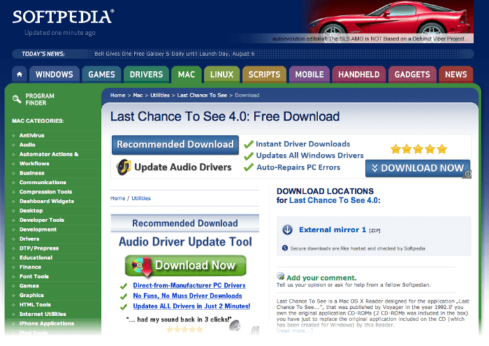
Example:
There are several websites, like Softpedia where there are two many ‘download’ buttons, making the users question which download button is the actual one. The real download button gets lost amidst the multiple fake download buttons which are the disguised ads.
Spamming Led Growth Hacking
Source: UX Planet
You hate email spamming. But what if your account is used to generate spam emails to those in your contact list? No, it’s not about your email account getting hacked but social services having access to your contact lists.
Often referred to as friend spamming, this kind of dark pattern UX designs get access to the users’ contact list to fulfill certain business goals and is one of the classic dark patterns in UX design examples.
Here, usually, services or apps ask for the users’ permission to access their email contacts in a way that looks like the apps are willing to help the users find their friends who are already using the same apps.
But in reality, what they do is spam your contacts by sending join up invitations.
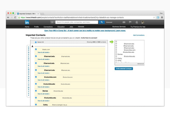
Example:
What can be a bigger example of spamming led growth generation than LinkedIn where the company had lost a lawsuit in 2015 for using the contact lists of its users for its own benefits. Blogger Dan Schlosser was asked to strengthen his network by the professional networking platform, LinkedIn. But what LinkedIn meant was sending 1000s of emails with just one click to contacts that were not on the platform and that too as from Dan and not from LinkedIn.
Forced Continuity
Source: Medium
Often referred to as a silent parasite in dark patterns, forced continuity starts so peacefully and nicely that the users fail to realize that they have been tricked for quite some time. And what’s involved here is neither contact spamming nor clicking on other ads, but money which makes it one of the darkest of dark patterns hall of shame.
These patterns usually work through disguised ads or button styling or even a pop-up window where users are asked to sign up and enter their credit card details to become eligible for the ‘Free Trial’. The trick here is when users check their billings after some time, they find out that a fee has been deducted every month from their credit card without any prior notifications.
The dark pattern happens when the free trial service ends and users are being secretly charged without any warning. And this design pattern is not only used by hungry start-ups or small companies looking for shortcuts to go big but reputed and popular companies as well.
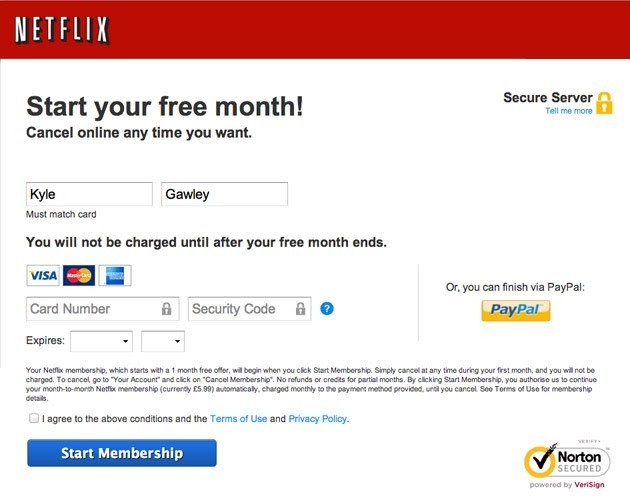
Source: KYLE GAWLEY
Example:
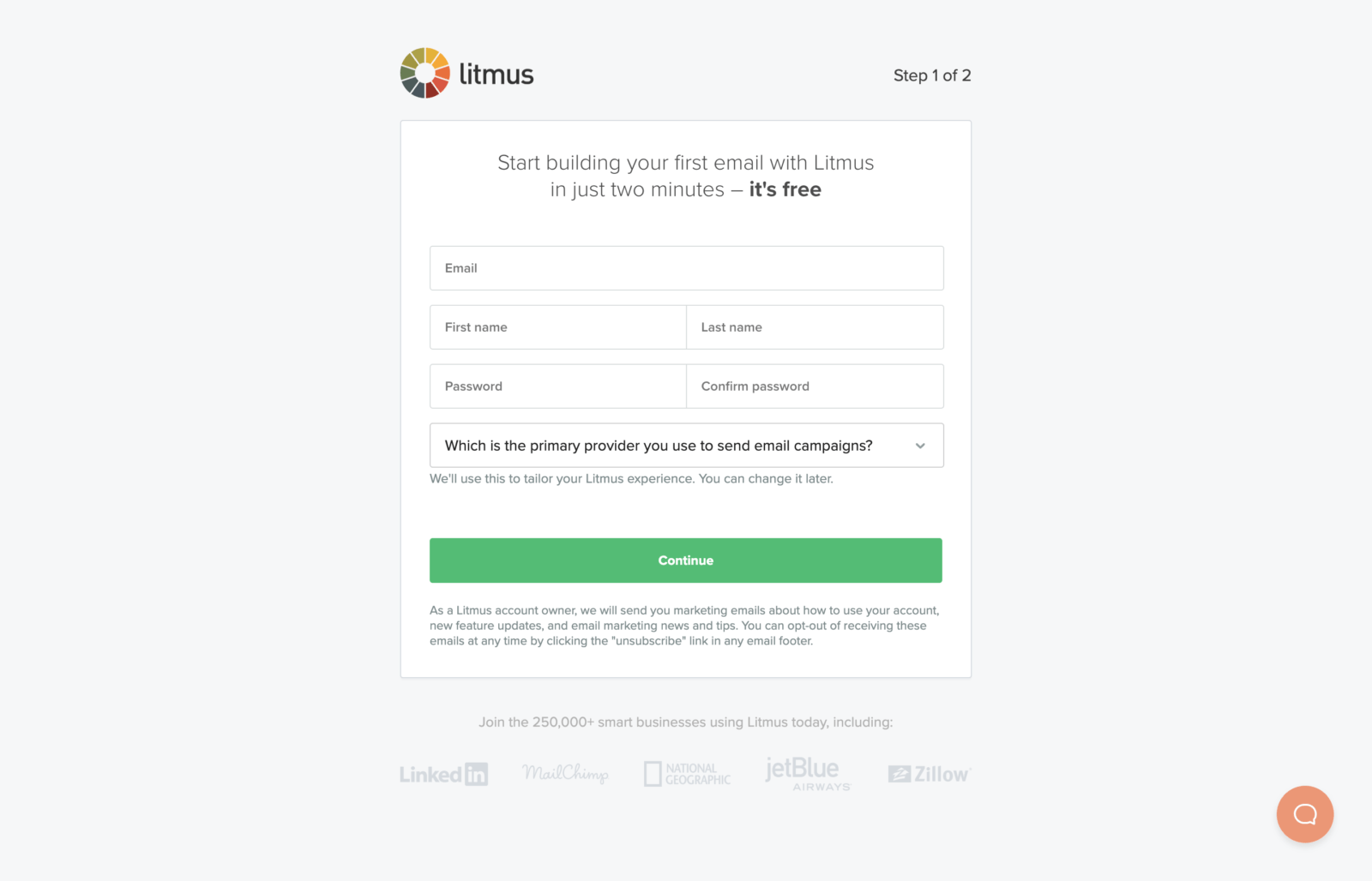
Big companies like Ryanair, PizzaHut, and even Netflix have been found to practice this dark pattern UX. Websites and apps like Audible, Litmus offer free trials. But once the free trial period is over, they don’t ask the users whether they want to continue with the paid version or not. They simply start deducting the charges.
Following the same pattern, Netflix, too, encourages users to sign up for their free trial as if they won’t be charged anything until after the free trial month. But, at the bottom of the very same page it is mentioned that if users don’t cancel their free membership before the free trial period ends, they will be automatically charged with monthly subscriptions.
Inertia Shopping
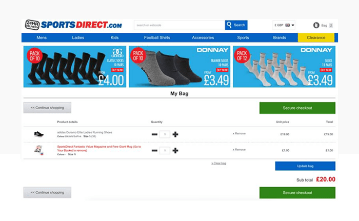
Source: UX Planet
While some call it ‘negative option billing’, some refer to it as the ‘expanding shopping basket’ trick, no matter by which name you call it, it’s another common dark pattern where an extra item is snuck in the cart during online shopping. The trick is done usually by a confusing or well-hidden opt-out button.
Though in most European Union countries this pattern is banned and illegal, still, some companies try different varieties of this.
Here the users are partially given control over what they wish to put in their shopping basket. Once they are done online shopping, before checkout they can see that extra items have been added to their basket without asking them for their permission. To cancel those extra added items, users need to deselect the selection box before checkout.
Example:
The website of Sports Direct is an example of utilizing this dark pattern where they offered a magazine and a ‘free mug’ to online shoppers. Now the trick is that the ‘free mug’ wasn’t free; it charged 1 euro and was added to the cart by default. If users didn’t actively ‘Deselect’ the ‘free mug’ option, they ended up buying it.
Hidden Charges
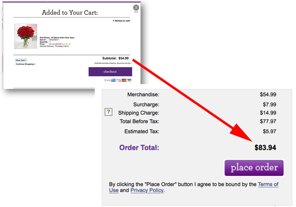
Source: Shopify
You have been in such a situation at least once in your life where you visit a website, like a product for the price it is listed; but at the last step of checking out, you find hidden charges added to your product. Yes, such hidden charges are nothing but one of the many examples of the dark (patterns) side of UX design.
In such patterns, unexpected costs such as packaging, shipment, insurance, taxes, delivery charges, and sometimes more are added and shown right only during the last step of confirming the order. Though users don’t like this additional and sudden change in the final price that too during the last step of ordering, they eventually end up completing the order anyway.
Example:
Like many other popular flower websites, on 1-800-Flowers too, additional charges are slowly revealed only after users agree on the initial cost. When users go through the products or the website, there is no mention of these additional costs or no highlighting them before the final purchase stage.
Wrapping Up
While some businesses opt for UX design services to craft website interfaces with dark patterns to fulfill their business goals fast; some find dark pattern practices simply to be unethical, and rather damaging to their brand image and relationship with the audience.
But then again, there’s no fixed rule regarding not utilizing dark patterns, even if it offers only short-term gains or results in customer dissatisfaction at times. And as long as a UX design is attracting more visitors as well as keeping them engaged, it is an effective one.
And since dark patterns often fulfill this primary purpose of having an impressive web UX, some companies see no harm in applying them.
Whether you’re in support of dark patterns or not, if you are looking for a worldclass UI/UX design company, then contact us at Klizo Solutions today for fast, reliable, and amazing web designing and development services that guarantee results!


