

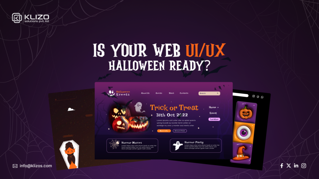
The witching hour of October is almost here. Which means, it’s time to cast a spell on your website!
Crafting the perfect Halloween-themed UI/UX can be as thrilling as it is tricky. But worry not, with our best UI tips for Halloween websites, transforming your digital presence with some spine-tingling UI/UX magic can get easier!
Whether you want to enchant visitors with eerie graphics or lead them through a spooky yet delightful user experience, the devil is in the details. From ghoulishly good animations to bewitching color palettes, the best UI tips for Halloween websites will make your design stand out like a full moon on a foggy night.
So, are you ready to give your site a hauntingly good makeover?
Then, grab your broomsticks, and let’s dive into the dark arts of web design that will have your visitors spellbound with some spine-tingling UI/UX magic!
Before we dive into the best UI tips for Halloween websites, let’s explore why adding a Halloween touch to your web design can be so beneficial. After all, adding a Halloween touch to your website isn’t just about getting into the spooky spirit—it’s a strategic move that can significantly boost engagement, drive traffic, and increase conversions.
By embracing the Halloween spirit, you not only make your website more festive but also tap into a powerful marketing opportunity that can enhance user experience, drive traffic, and boost sales. So, get ready to spookify your site using the best UI tips for Halloween websites that we’re about to reveal, and watch the magic happen!
Hell yeah, it’s time to give your website a spooky makeover! A well-crafted Halloween web design can captivate visitors and create a memorable experience. By integrating spooky UI design elements, you can transform your site into a hauntingly delightful destination. Here are the 10 best UI tips for Halloween websites in 2024.
Nothing screams Halloween like the right color palette. Shades of black, orange, deep purple, and dark red are the go-to hues that instantly evoke spooky vibes while keeping things classy and on-brand.
But it’s not just about picking colors from a witch’s wardrobe—you must blend them with your existing brand colors to ensure cohesion.
Websites frequently adapt their color scheme to include dark tones, purple overlays, and pumpkin orange highlights to create a festive yet familiar atmosphere for users.
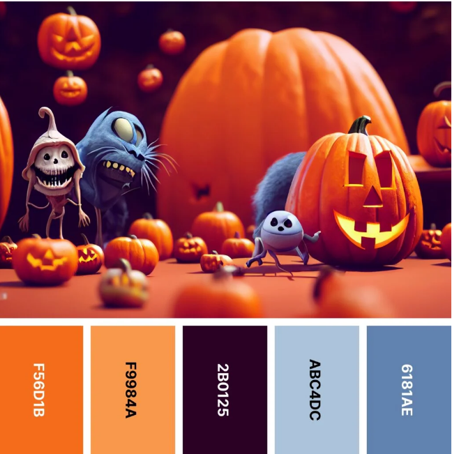
Pro Tip: The trick is subtlety; you want to add the Halloween magic without overwhelming your visitors with too much fright! And this seasonal twist is one of the best UI tips for Halloween websites because it ensures visitors are immediately hit with spooky feels while staying in tune with your site’s core aesthetic.
The way your text looks can also play a significant role in setting the Halloween mood. Using eerie, Halloween-specific fonts in your headings, CTAs, or banners adds a chilling vibe, but make sure your body text is still clear and readable.
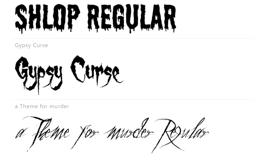
Pro Tip: Featuring bold, decorative fonts like “Creepster” in your website headlines while keeping the body text simple and user-friendly allows the site to scream Halloween without compromising readability.
If you’re looking to make an impression with typography, this is one of the best UI tips for Halloween websites to follow—don’t be afraid to go bold with spooky fonts!
Why stick with regular icons when you can creep things up a bit?
Swapping out your usual design elements for Halloween-themed ones like skulls, witches, and cobwebs can elevate your website’s spooky spirit. The key here is to keep it playful and fun, without cluttering your design
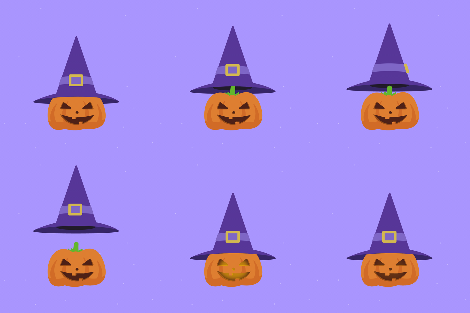
Pro Tip: Swapping out your regular icons for ghoulish ones like bats and pumpkins across your site’s navigation and product listings can be an effective visual trick that not only ties into the best UI tips for Halloween websites but also keeps users immersed in the seasonal spirit while navigating your site with ease.
This subtle change gives visitors a playful hint that your site is ready for the Halloween season without interrupting user flow or usability.
A well-placed spooky animation can send chills down your visitors’ spines (in the best way!).
Animations like ghosts that float across the screen or bats flying when you hover over buttons can bring your site to life—perfect for Halloween night.
Example: The Witcher Netflix website added eerie animations to its homepage during Halloween, with shadowy monsters and subtle, creepy movements in the background. These animations gave the site an extra dose of mystery without taking away from its usability.
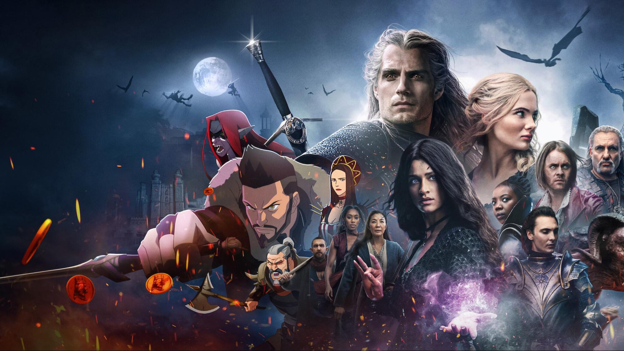
Pro Tip: While animations are fun and, of course, one of the best UI tips for Halloween websites, too many or too intense can distract users from your main content. Remember to keep it spooky but functional!
You know what adds an extra layer of eeriness to your website? Subtle, well-placed sound effects.
A creaky door here, a distant wolf howl there—these sound effects can surprise and delight visitors when used sparingly. Sound can immerse users in the Halloween experience, but make sure not to overdo it. No one likes a haunted website that’s slow to load!
Example: The Pottermore website (now known as Wizarding World) embraced sound effects for its Halloween content. Visitors could hear eerie whispers or footsteps when hovering over certain sections, creating an immersive experience that felt straight out of Hogwarts. These sound effects complemented the magical and spooky vibe without overpowering the rest of the site.
Pro Tip: Use sound effects only for specific actions, like when a user hovers over a button or opens a dropdown menu—just enough to make a spine-tingling impact, but not so much that users want to bolt in the other direction.
CTAs are the lifeblood of any website, but during Halloween, they deserve a spooky makeover too.
Instead of your usual “Buy Now” or “Subscribe,” spice things up with Halloween-themed CTA buttons, shaped like pumpkins, spiders, or even witch hats. Add creative text like “Get it before the witching hour!” or “Snatch your treat!”
Example: Starbucks is famous for its seasonal drinks, and during Halloween, they often give their CTA buttons a little spooky charm. On their app and website, you might see CTAs styled with pumpkin icons or special Halloween fonts encouraging users to “Grab Your Pumpkin Spice Before it’s Gone.”
Pro Tip: Adding these wickedly creative CTAs makes your site more engaging and aligned with the season, while still driving conversions.
Nothing says “fun and fright” like interactive elements that get your visitors engaging with your content. Incorporate gamified features, like virtual pumpkin carving or a “find the hidden ghost” contest, to keep visitors hooked and coming back for more spooky fun.
Example: Google’s Halloween Doodle of 2018 offered an interactive multiplayer game where users could compete as ghosts. It was a massive hit because it was fun, easy to play, and spread the Halloween spirit globally. Adding simple, interactive games can elevate your Halloween web design to another level.
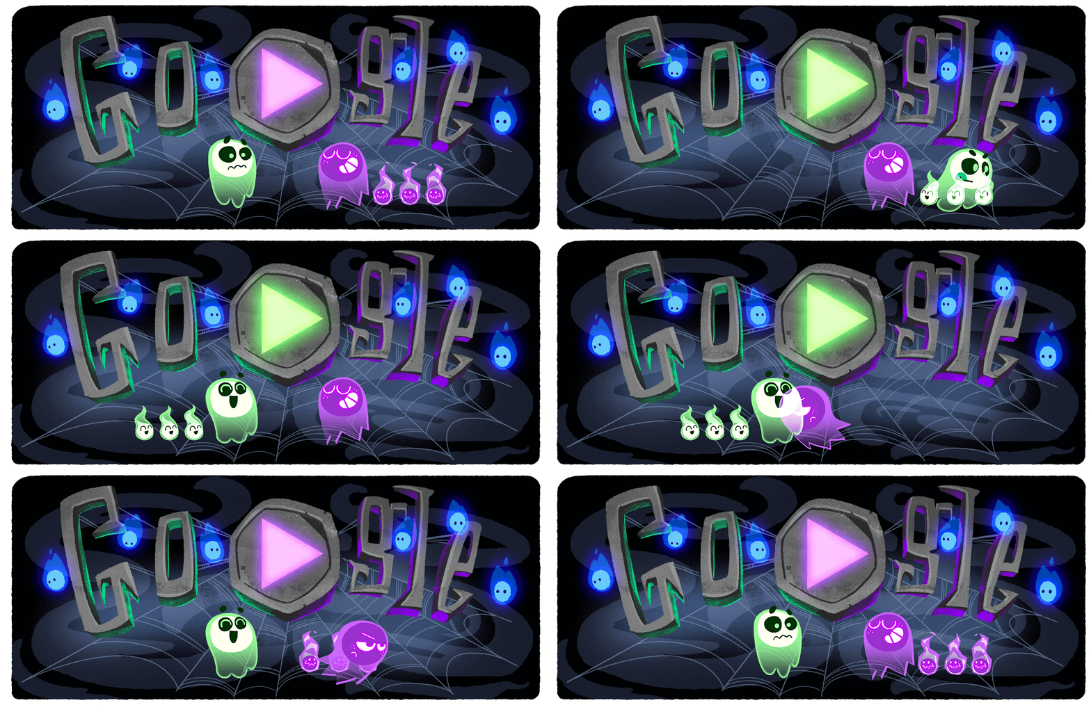
Pro Tip: Interactive elements are memorable, but make sure they don’t slow down your site or interfere with user experience. Balance is key to keeping the spooky fun without turning your site into a haunted house of errors.
When it comes to giving your website a Halloween twist, there’s no better place to start than dark mode! Switching from your usual bright layout to a deep, shadowy design instantly sets the eerie tone.
A darker background not only highlights your Halloween graphics but also enhances user focus on your CTAs.
Example: Spotify famously launched a dark-themed Halloween playlist page, combining shadowy hues with haunting graphics. The result was an immersive experience that perfectly matched the mood of the season, enticing users to explore spooky tunes while staying visually engaged.


Pro Tip:
Dark mode doesn’t just look spooky; it’s easier on the eyes during nighttime browsing, which could boost engagement when users are scrolling late into the witching hour. This is one of the best UI tips for Halloween websites—don’t miss it!
If users stumble upon your 404 error page, why not make it a spooky adventure?
Halloween is the perfect time to transform the dreaded “Page Not Found” error into something fun and creative. A Halloween-themed 404 page can add a bit of humor and personality to your website while keeping visitors engaged.
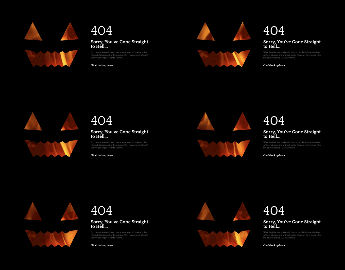
Pro Tip: You can add Halloween-themed language, like “Oops, you’ve wandered into the haunted woods!” or “This page has vanished into the Halloween mist… let’s get you back on track.” This is one of the best UI tips for Halloween websites, that you can use cleverly to turn a frustrating moment into a memorable interaction.
Pop-ups are often seen as the villain of the web, but they can actually be a great way to surprise (in a good way!) and engage visitors—especially when given a fun Halloween twist.
Holiday-themed pop-ups are perfect for offering special discounts, promoting seasonal products, or inviting visitors to join Halloween-themed events. The trick is to align the visuals with spooky imagery while keeping the message playful.
Pro Tip: Make sure your pop-ups are visually appealing without being too intrusive. Haunted houses may be fun in real life, but they’re not when it comes to user experience!
Keep them light-hearted and use engaging copy like “Don’t miss this spook-tacular deal!” for maximum impact. This is another example of the best UI tips for Halloween websites, making sure your site stays on-theme while offering users something valuable.
You can incorporate Halloween themes by adding subtle visual touches like spooky icons, eerie animations, or seasonal banners without altering the entire layout. Update the color palette with dark shades and orange accents, or include Halloween-themed images to create a festive yet cohesive look. Alternatively, you can always choose professional web design services as it’s a hassle-free way to achieve the desired festive look quickly and efficiently.
The classic Halloween palette includes black, orange, and purple. You can also mix in dark green, blood red, and gray to create a spooky, mysterious feel. Just make sure the colors complement your brand identity while keeping the Halloween vibe.
Spooky elements like animated ghosts or bats can enhance your theme but should never distract from usability. Keep navigation clear, avoid overwhelming animations, and ensure that key actions (like buttons and links) remain easy to find and use.
Fonts like Creepster, Shlop, or Blackletter-style typefaces can set the spooky tone. However, balance these with legible fonts for body text to maintain readability. Decorative fonts work best for headings or calls to action.
Absolutely! Halloween designs can remain accessible by sticking to high-contrast color schemes, maintaining clear navigation, and ensuring all visuals have alt text. Avoid overly complex or fast animations, which could disrupt the user experience for some visitors.
You can add interactivity with features like animated Halloween icons, hover effects (e.g., images that change when hovered over), and gamified elements like virtual pumpkin carving. Ensure these elements add fun without slowing down the site or impacting usability.
A well-designed Halloween-themed website can enchant your visitors and leave a lasting impression. With these best UI tips for Halloween websites, you can create a digital experience that’s both spooky and spectacular.
But why stop there?
At Klizo Solutions, we believe that exceptional UI/UX design is the cornerstone of a successful digital presence. Connect with us today to discover how our UI/UX development services can add that extra touch of magic to your online presence, crafting user-centric designs that not only look stunning but also provide an intuitive and delightful user experience.
Whether you’re looking to revamp an existing design or start from scratch, we integrate the latest industry trends to make your app or website stand out. Our process involves empathy mapping, competitor analysis, and creating detailed prototypes to avoid costly redesigns and ensure a seamless user journey.
So, don’t wait—let Klizo Solutions help you cast the perfect spell on your digital audience with the best UI tips for Halloween websites! Remember, a little bit of Halloween flair can go a long way in making your website truly unforgettable.
Previous article
Joey Ricard
Klizo Solutions was founded by Joseph Ricard, a serial entrepreneur from America who has spent over ten years working in India, developing innovative tech solutions, building good teams, and admirable processes. And today, he has a team of over 50 super-talented people with him and various high-level technologies developed in multiple frameworks to his credit.

Subscribe to our newsletter to get the latest tech updates.