

So, you are all set with a stellar website, have a solid marketing strategy in hand, thinking or probably already investing in paid search ads, enjoying impressive website traffic!
(Well, I know that it seems like a fantasy scenario almost! Still for the sake of the example, just assume all the best-case scenarios!)
However, still, the conversion rate is not that satisfactory! What a waste of effort, right? Well, not really! Maybe it is time to get your hands busy to revamp or craft a killer landing page.
You may think that you already have got an entire website with so many pages that look stunning. But honestly, in the case of landing pages, just “looking pretty good” is not really enough.
Then what to do? How to build landing pages that convert and sell? That is what I am going to discuss here. Majorly, I am going to cover the following points here.
Crafting an effective landing page is no rocket science! But it definitely needs smart work and expertise.
Convincing and converting your visitors is the main objective of creating a landing page. And thus, a landing page is more focused!
It is a standalone page of your website that is not really connected to your site’s normal navigation. Mainly, such landing pages are crafted keeping a single objective in mind i.e. Call-to-Action or conversion.
I would say that landing pages are specifically created for advertising or marketing campaigns. Now, a landing page is not the same thing as your website’s homepage! Rather a landing page is kinda different from any other pages your website may have.
A home page might have multiple links along with dozens of other potential distractions. But a landing page technically should have just one link i.e. the CTA. Convincing and converting your visitors is the only objective of creating a landing page. And thus, a landing page is more focused I would say. Also, crafting a stellar landing page is a big help in increasing your site traffic and getting leads in an organic way.
Usually, you can see these two archetypal landing pages depending on the purpose it serves. Professionals can come up with the right type of landing page based on your business requirements.
So, now that you know what a landing page is and how it is a bit different from your regular website pages or the home page, I am going to share some pro tips to craft a winning landing page that can be a big help to boost your business conversion rate.
Just because you know how to include different design elements into a page, does not mean you have to flaunt all your skills at once on a landing page. Trust me, excessive use of different design elements on a single page makes it look a bit congested.
Let your design elements breathe! Rather you can opt for a minimalist design approach. This minimalist design is trending these days a lot.
When your primary goal to create a landing page is to convert and sell, you need to make sure that you are highlighting and conveying the right messages through its design. It is better not to confuse the visitor with cluttered page design.
Hence, I would suggest you create a landing page that has a clean and organized design. In the next points, I am going to explain what design elements should be your priority while building a landing page.
Usually, to form an opinion about how a product is, a consumer may take around 90 seconds time. Interestingly, 60% to 90% of this interaction is based alone on what the product color is!
Just like different colored roses express different emotions, the color combination, or the color pallets you are using on your landing page is definitely going to make a difference. Why am I saying this? Well, according to science, color elicits emotion and it can result in positive or negative feelings.
Source: Salesforce
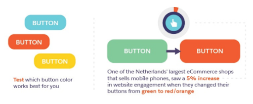
A case study shows that the conversion rate can increase by 24% if you pay minute attention to the color psychology and apply it judiciously among other design elements.
So, it is time for the landing page designers you hire to play around with color! It is better to go with such color pallets that suit your brand and convey the right emotion about your brand to your target audience.
Source: https://www.picture-of-day.com/
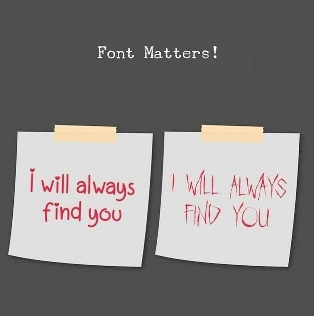
I hope the image above is explaining enough how choosing the right typography matters a lot while designing a landing page. The message might be the same but what typography you are using is making all the difference. A wrongly chosen typography is enough to kill all your effort to build a landing page. So, choose wisely.
Moreover, optimizing the typography of your landing page means you are optimizing the page for readability, usability, accessibility, along with an overall balance in the graphics.
My tips on typography would be
So, here is the positivity out of something negative! Yes, I am talking about whitespace or negative space. Show your smartness in using it while crafting a landing page for conversion boost.

Again, another self-explanatory image here! Whitespace holds crucial importance in landing page design. It helps to provide a breathing space for your landing page design.
Your landing page copywriting needs a professional touch. It is not like you are talking to the visitor face-to-face and can convince the visitor through your verbal words. Rather, you have to convince your visitors that you are the right choice for what they are looking for through your landing page copywriting.
So, you need to create an engaging and compelling copy for it. And for this, having an in-depth knowledge of the target audience is necessary. It would help to come up with such a language tone that your targetted audience can relate to. Clean, crisp, and direct – your landing page copy should be like that.
Source: Our Social Times
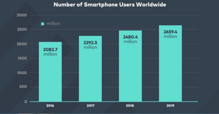
The number of smartphone users is only continuously growing over time. So, if you are not making your landing page optimized for the mobile users, you are missing out on a huge target audience.
This is why while making a landing page, you should always opt for the mobile-first strategy! If your landing page design lacks responsiveness or looks poor from a mobile device, you might have to rework on it first to boost conversion.
When your main objective is to build a landing page for increasing the conversion rate, you have to make sure you are making it visually appealing. And the addition of relevant images would make it so. As per a recently done case study, showing real people’s images are more effective than using stock images! Yes, it enhances the trust factor among your audience that is crucial for boosting conversion rates.
Well, you can add a video as well on your landing page. A nicely made edited video can keep your visitors engaged. By connecting with them, you can easily showcase how your services and products are the best choices for your visitors. It all can be done with a well-made video on the landing page.
Here is the most important segment of your landing page i.e. the CTA. This is the part where visitors get convinced and submit their details and contact you to avail your offered services or to purchase your products.
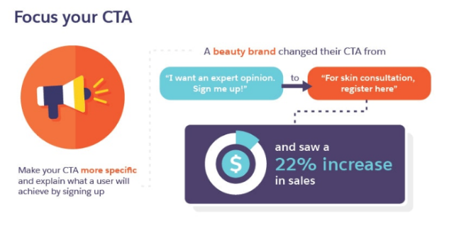
Source: Salesforce
I would say try to make your Call-to-Action more specific. Your landing page CTA should explain well what a visitor would get if they sign up or fill-up the form.
You surely do not want to turn off your visitor’s interests by putting up a landing page live with glitches on it! This is why testing your landing page before making it live is essential. Check responsiveness, thoroughly check every spelling and grammar on it, check whether every design element is being displayed properly or not from different devices.
Here I am going to mention some additional secrets that play crucial roles to boost conversion rates through your landing page.
Do you know you have more or less 5 seconds of time in your hand to engage and convert your visitors? Within this short span of time, you have to impress your visitors with your landing page. At Klizo Solutions, our skilled and experienced team is here to assist you in crafting killer landing pages that drive conversion rates and sales.
We first listen to your requirements minutely and then our experts come up with the most feasible solutions. The tips and tricks I mentioned above are parts of our core process to devise a landing page that sells. Also, we hold sheer expertise in this domain.
All these are our specialties. So, if you are looking for stellar landing pages that can give you a satisfying sales number, get in touch with us.
Previous article
Blockchain in Cybersecurity: The Choice You Should Make Today
Joey Ricard
Klizo Solutions was founded by Joseph Ricard, a serial entrepreneur from America who has spent over ten years working in India, developing innovative tech solutions, building good teams, and admirable processes. And today, he has a team of over 50 super-talented people with him and various high-level technologies developed in multiple frameworks to his credit.

Subscribe to our newsletter to get the latest tech updates.