

Have you read the book “The Super Power of Rightly Designed CTA Buttons”?
No, right?
I mean, how could you, there’s no such book by this name!
Wait, wait, I’m not messing with you. What I’m trying to say here is that there should be one, a book. More like a detailed study on the power of the right call to action buttons in improving the conversion rate of a website. So that every designer and website owner becomes aware of this tiny marketing tool and its huge potential.
Believe me or not, studies have shown that poorly designed CTA buttons lead to increased bounce rates as people aren’t sure what to do next after landing on your website.
How can you make your CTAs effective?
What to do if your CTAs aren’t performing the way they should?
Where can you get the necessary assistance in finding some kickass CTAs that convert like never before?
To get all the answers to your ‘Wh’-queries, you gotta go through this article. Let’s get started!
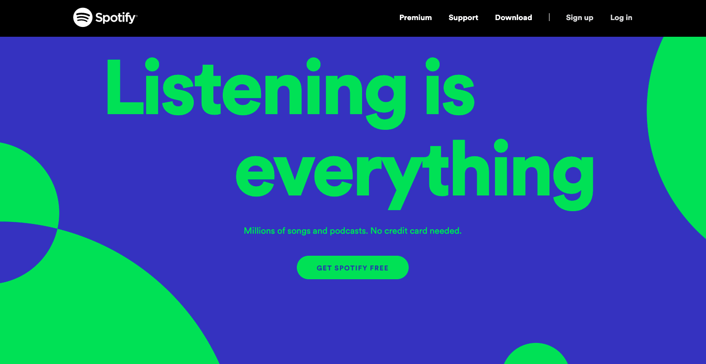
Image Source: Spotify
A CTA or Call-to-Action button is a button that tells the users to take specific actions. Now, when you use CTA buttons on your website or landing pages, they serve as marketing tools, guiding users towards fulfilling your goal i.e. conversion.
In simpler words, CTA buttons are those buttons that you want your users to click to ensure their course of action in your favor. These buttons prompt users to take the actions, that as an owner of the website you want them to take.
Just take a look at Spotify’s home page. Is it really hard to spot the button? I think it’s not! And that’s what exactly CTA is about, easy to spot, and a distinguished button!
CTA buttons are like an open secret of boosting a website’s conversion rate. People know it but still, act like they don’t and eventually ignore it.
Do you think your existing CTA buttons are failing to do what they are supposed to, then they might be suffering from the following issues.
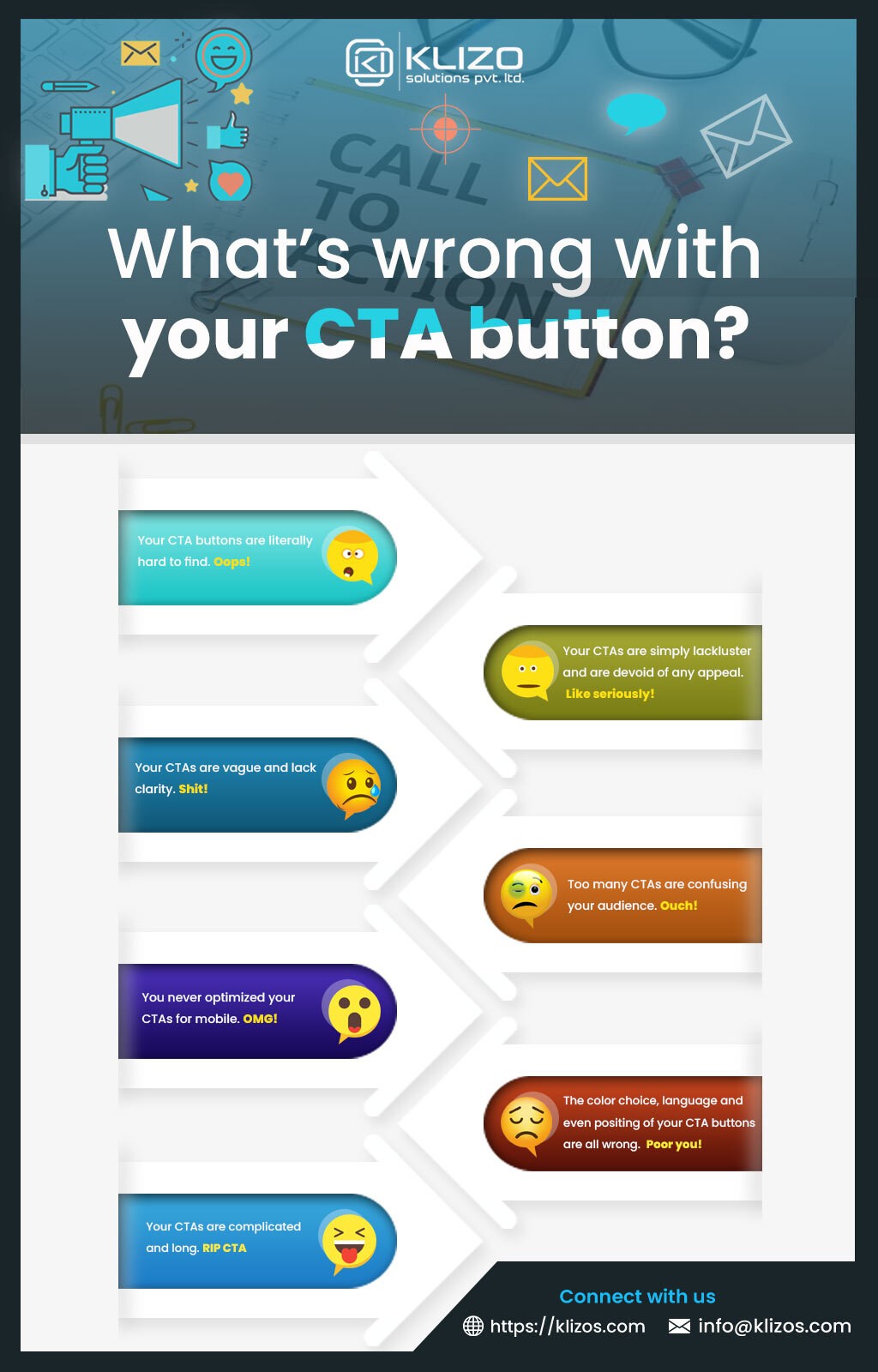
If all these things are what you do with your CTAs, then buddy, it’s time you dedicate a moment of silence to your terrible CTA practices and move on to such CTA designing ideas that can get you a standing ovation.
Knowing what CTA buttons are or what their functions are, is enough to give you an idea about why you shouldn’t ever neglect to design them carefully.
But still, if you have never paid attention to them, then here are the ways you can design CTA buttons better, like a Pro!
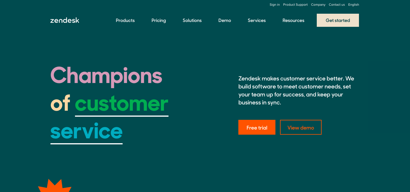
Image Source: Zendesk
Have you been using boring words as texts in your CTAs?
Well, then wake up! It’s time you give your CTA texts some real action-filled touch.
Remember, the text that you use in your CTAs, matters beyond what you can imagine. The more action-oriented and striking you make them, the greater results you’re to reap.
So replace the boring words like “enter”, “submit” etc. with more exciting and engaging words such as “Try for Free”, “Join US”, and “Get Started”.
Don’t you think that if the CTA button text “Go” on the website of Children’s Museum of Pittsburgh was written as “Book An Event Now!”, the whole CTA thing would be more exciting and engaging!
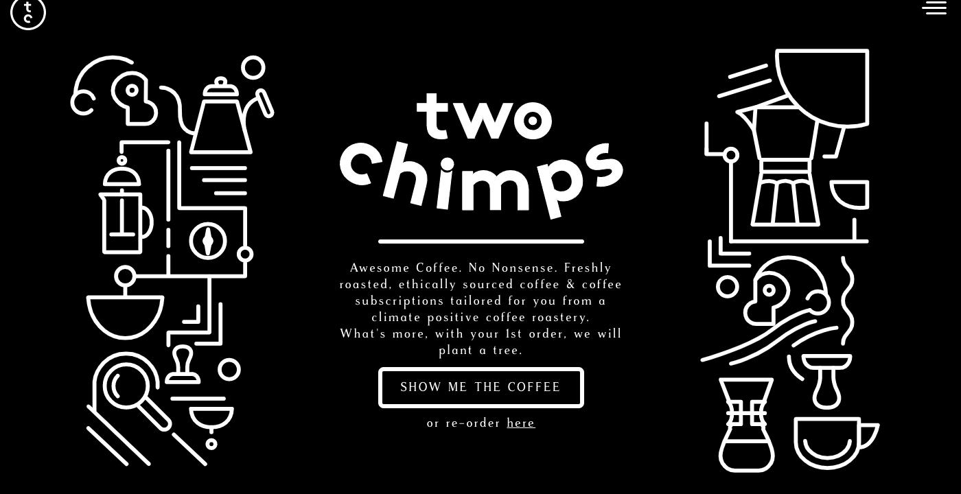
Image Source: Two Chimps
Stretching your button text may seem tempting. But keeping the text on your CTA button short, simple and clear should be your priority to make the buttons effective.
It will not only reduce any chance of confusion but help the users immediately and understand what they should expect or what can be the result of clicking on the CTA button.
If you do need to add some information or explanation, try including them not in the button but outside the button, especially underneath the button.
Whether you use it in your website or landing page design, a short and easy-to-understand CTA always strikes the right chords with the audience.
Tell me, which one of these sounds more appealing to you?
Reserve My Table!
Or,
Reserve A Table / Reserve Your Table!
The first one, of course! But why?
Because instead of implying ‘you’ or ‘your’ or addressing the audience in the second person, when you use the first-person approach, it attracts the users more.
Changing the point of view might seem a minor thing, especially in CTA buttons. But, studies have shown that when you address your audience by putting yourself in their shoes, the number of clicks increases.
Yes, users are indeed more likely to click on those CTA buttons that do have a personal touch. But at times, you need more than just a personal touch or first-person approach.
Creating a sense of urgency is also necessary to get impressive click-rates.
Create an Account (No)
Create an Account Now! (Yes)
Or,
To Get 50% Off, Sign Up Today! (A big YES)
By creating a sense of urgency by adding sensitive words in your CTAs like “Today” and “Now”, you make the users think they might miss out on something if they don’t click or act immediately, and they, as a result of this, do CLICK on the CTAs.
From the size to the shape, style, color, and font, everything has a role to play in determining the effectiveness and impact of your CTA buttons.
No, there’s no magic color or magic font style for CTA buttons using which an immediate influx of user conversion can be guaranteed. As per the color psychology on website design, certain color evokes certain emotions and responses in users.
As long as the color, font style, letter spacing, size of the button as well as text ensures an effortless reading experience to the users, they are good to go.
Some handy tips to make your CTAs more engaging and effective are:
Are you done with choosing the appropriate color, size, shape, and best font for CTA button?
Well, if you’re done with designing your button, next is placing it at a perfect position on your web page.
Depending on your page layout, select a prominent location such as a place where users will look first i.e. “above the fold” in newspaper terms.
Remember, when the positioning is right, CTA buttons receive the visual prominence and attention that they should.
And this seems to be an utter truth when it comes to the number of CTA buttons on a webpage.
Having multiple CTA buttons for one page makes the users explode with indecision.
Remember, users, desire to be guided. And how can you guide them to take an action? Buy either limiting the number of buttons or give one button more weight than others in case you have to add multiple choices.
Never thought whitespace could matter even in CTAs?
Well, now you know that it matters. It acts like a trampoline for your buttons – lifting them from the page and landing them right amidst the users’ attention.
Whitespace helps the button stand out on a web page.
So, as long as you’re using a healthy amount of whitespace surrounding your CTAs, it’ll be hard to ignore or overlook them on your webpage.
Just revamping your old CTAs or creating new CTAs with the help of a call-to-action generator is not enough. You gotta test them too!
Why? Because unless you test the performance of your CTAs before going live with them, how would you know for sure whether their positioning, color, size, and all are perfect or not?
Even to find out whether the CTAs are properly connected to the desired page of the website or not, testing the buttons is crucial.
In case, you’re still reluCTAnt to spice up your boring CTA designs; yet totally get their significance, then we, Klizo Solutions, are here to help you.
We understand that CTAs are a crucial component of your website and your website’s conversion results. And to come up with effective and converting CTAs both time and dedication are required.
What if we offer you the time and dedication required for designing effective CTAs?
Omit the “if” part and know that we are here to save you from all your existing underperforming CTAs. We have an amazing designing team dedicated to helping our clients make the most out of these strategize marketing buttons.
So, what are you waiting for? Get in touch with us and close the gap between your website and your conversion expeCTAtions.
Previous article
Joey Ricard
Klizo Solutions was founded by Joseph Ricard, a serial entrepreneur from America who has spent over ten years working in India, developing innovative tech solutions, building good teams, and admirable processes. And today, he has a team of over 50 super-talented people with him and various high-level technologies developed in multiple frameworks to his credit.

Subscribe to our newsletter to get the latest tech updates.