

Do you know that each color used in your website evokes certain emotions and attitudes in users? Yes, color psychology in website design has a more serious role in making a website engaging and attractive than you can imagine.
The term color psychology refers to how different colors motivate different behaviors in humans. When it comes to your web design, using the right color can make your website engage the target audience better, influence sales, and boost conversion rates.
Colors have the potential to boost customer loyalty or destroy it. But just like men and women have different color preferences, users prefer certain colors for particular business niches. Hence, understanding how to use a color palette in web design becomes essential to build a strong, successful, and relatable brand.
So today, in this article, I will talk about the most popular and commonly used colors in web design, their meanings, the emotions they trigger in the users, and the industries they best represent!
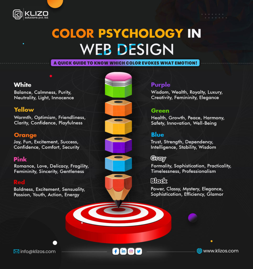
White is the color of purity, innocence, neutrality, virtue, cleanliness, sincerity, happiness, and safety. It is one of the most commonly associated colors as the background of websites!
Whitespace in websites serves as a powerful web design feature for marketing due to its versatility and quality to draw attention with its pristineness. Acknowledging the significance of white color psychology in design, brands like ASOS, Adidas, Intuit Turbo, Scotch & Soda, etc., have used it as an effective marketing strategy in their websites.
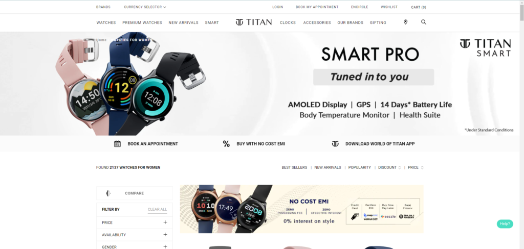
Theoretically, white can be used for any website as the effect of its application entirely lies upon the other colors used along with it. However, using too much of it can signify emptiness and isolation. Even the stark contrast of true white with true black becomes painful to the eyes as it reflects light and can make a website look off-putting and cold.
White is one of the first choices of any website design company for developing websites related to the healthcare industry. Apart from this, white can also work great for science and high-tech websites. This color can work wonders for websites of luxury items when matched with gold, black, different shades of gray or silver.
Yellow is fun. Yellow is playful. This bright and energetic color is excellent for creating exciting websites that users may find thrilling. Have you ever wondered about what are the accent colors in web design? Then know that yellow is one! According to color psychologists, it is the color of happiness.
World-renowned optical products company, Nikon, uses yellow in its branding and online marketing strategy, encouraging people to capture moments of youth and happiness. You can also observe the presence of yellow in the logos of reputed brands like McDonald’s, National Geographic, IKEA, Snapchat, etc.
Too much yellow can make a website look overwhelmingly abrasive. Plus, if you end up using the wrong hues or too bright shades of yellow in web designing, it can make your website look spammy, cheap, and straining to the eyes. Hence, opting for corporate website design services can be the best step to utilize this color in the right amount on your website.
Various brands prefer the color yellow as their website background color to make their website more engaging and evoke a sense of happiness among the users. It can be a suitable color for corporate branding and advertising too. However, in web designing, the application of yellow is scanty than other accent colors, as experts believe that there is nothing subtle about this color, and even a tiny amount of it can seem flashy.
As per website design psychology, orange is the color of happiness, energy, and warmth. Due to the overpowering effect of yellow, the warmer tones of orange are more prevalent in web designing. Well-known as a vibrant color for optimism and inspiration, strategic use of orange on websites can evoke enthusiasm, excitement, ambition, and fun. It is also known as the ‘new red’, only without the dangers associated with the color red.
You can find different orange shades in action on Whataburger, Orange Soda, Amber Support Services, Story Cubes, etc., websites.
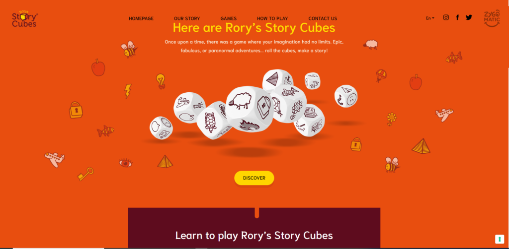
Yes, orange is less intense than red. But overdoing it on websites can make it overpowering. Despite being a bright and attractive color, using it tastefully on websites requires in-depth knowledge of color psychology. Use this color wrong, and it can give your website an appearance of utter chaos.
Orange works fantastic for automotive, entertainment, technology, eCommerce, childcare, and food-related websites. Even when it comes to online marketing, lighter shades of orange are as popular as yellow. It adds the much-needed zing to a website when combined with the right colors the right way!
Pink is a lighter tint of red. But it has completely different associations from red, which are often violent and angry connotations. Pink represents compassion, sophistication, love, romance, and sincerity. Due to its nurturing and non-threatening effects, users find it a reassuring and calming color. Breast cancer awareness campaigns use the color pink, which breaks the typical notion where things associated with girls or women are perceived as meek or weak.
While brands like Baskins Robbins, LG, Airbnb have used the different shades of pink in their brand logo, websites like Barbie, STACK Magazines, Victoria’s Secret, Betsey Johnson have trusted pink to create a powerful brand presence online.
Be cautious when using pink on your website. While light pink can make a website feel too sweet or sentimental, even fragile and delicate, using bright pink may feel gaudy. Intense shades of pink can give a boisterous and euphoric look to a website. Even too much pink can look immature and show powerlessness.
Go for pink if your website sells feminine products and services or features content specifically meant for young girls or women. It can also be ideal for websites that sell baby products, confectionery items, bathroom products, soft toys, etc.
Red is believed to be the most stimulating color of all and probably the best color for online marketing, too. It is also the most visible one in the color spectrum and, according to many, the most appealing color for websites. Psychologically impacting the mind of viewers, red can increase heart rate and cause fast breathing.
You can find the color red in abundance in the logos of the biggest food chains in the world like McDonald’s, KFC, Burger King, Pizza Hut, and on the websites of Coca-Cola, YouTube, KitKat, TedxToronto, etc.
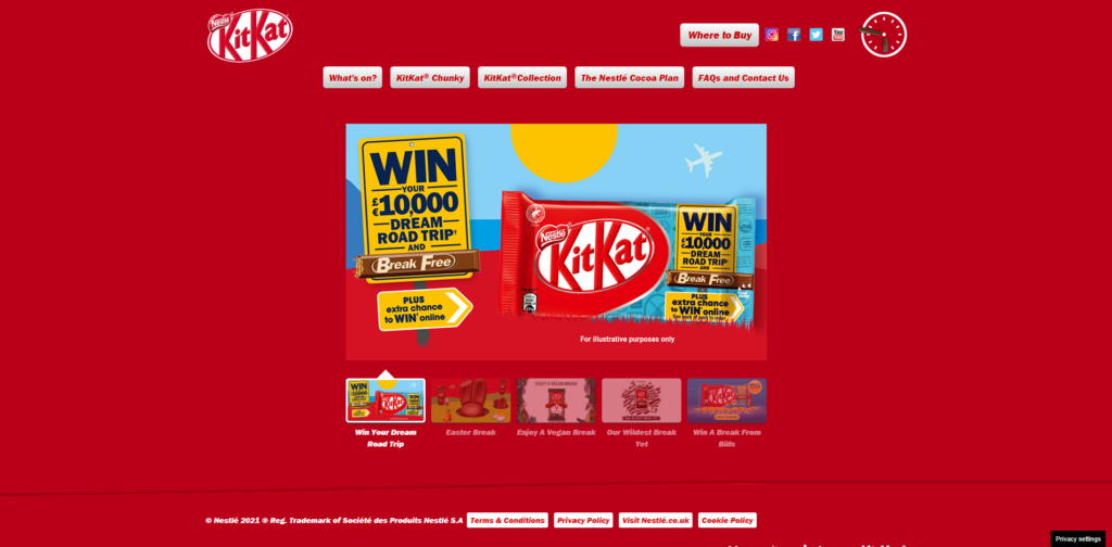
Overusing any color is never suggested. Not even the color red, no matter how effective it is for grabbing attention. Since red is associated with violence, war, anger, aggression, danger, and fire, too much red can be overstimulating and over-exciting, something you don’t want for your web design.
As proper use of color psychology website design, red works best for websites dealing with fashion, sports, entertainment, food, advertising, marketing, health services, and emergency services.
Purple is associated with nostalgia, sentimentality, wealth, and royalty. It is commonly known for its spirituality and imagination and hailed as one of the calming colors for websites. It represents a perfect amalgamation of the emotions portrayed by two different colors, i.e., the reliability and stability of blue and the power and energy of red.
Purple is also referred to as an intriguing color, representing new ideas and mysteries while creating a soothing effect at the same time. Brands using this color in their web design include Cadbury, Hallmark, PassLocker, Yahoo! Mail, and the list goes on.
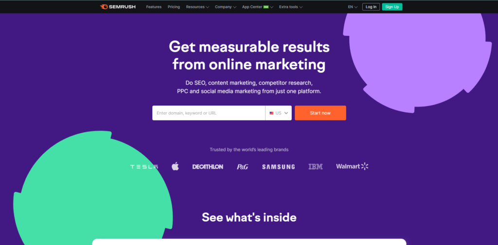
Using deeper and darker tones or the wrong purple shade can make a website feel distant and even look cheap and gross. Using purple too much in your web design can cause distraction or introspection in your audience due to its intriguing nature.
Purple works great for websites on beauty products, massage services, healing, yoga, astrology, and spirituality. Since adolescent girls tend to like this color, you can present any content related to them using this color. For developing websites of feminine brands, purple can be a great choice. Brands willing to communicate their expressive and innovative services and products often like purple in their web design!
For the eyes, green is one of the easiest colors to process. It offers a relaxing and harmonizing effect. It is associated with nature, calmness, health, growth, generosity, fertility, harmony, peace, energy, and support and reflects life, peace, and rest.
The use of green has made the beer brand Heineken stand out from its competitors. Brands like Starbucks and Nuffield Health also use green to build a strong, intense, and eye-catching brand image.
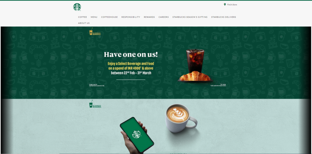
Unlike other colors, green has the least negative effect. However, it may not be ideal for tech-related website designs or promoting brands selling luxury goods. Even for websites targeted towards adolescent girls, green may not be the right choice.
Using green as the accent color in your website color schemes can work great for tourism, science, medicine, and human resources. Websites that deal with sustainability and the environment can also find it very effective. The use of green is most common in nature-related websites, restaurants, economic exchange, and health-based stores.
Blue is the color of intelligence, safety, trust, dependability, and security. Using this color in web design is believed to boost the conversion rate. Industries that need to develop a strong sense of trust in the audience, such as cybersecurity, banking, and insurance, tend to use this color in their logo and web designing projects.
Facebook, the world’s largest and most popular social networking site, is blue. So yes, blue is one of the most trusting colors and hence heavily used by big internet banks like CapitalOne.com and online payment operating companies like PayPal.
Using too much blue or some of its shades can create a sense of aloofness, making your website appear cold and heartless. In some regions, blue is the color of mourning and sadness. Even when applying in any food-related web design, it’s best to avoid blue as it is associated with curbing appetite.
You can find this color mainly in the financial sector, health sector, and large corporations for its association with dependability and non-invasiveness. The application of blue can also be excellent for websites related to science, technology, dentistry, legal, government, and medical services.
Gray represents balance and neutrality in color psychology. Since it is a shade between black and white, it shares mixed color meanings. It can impress users and achieve the right tone when used in the right amount. This color is usually associated with professionalism, formality, practicality, power, authority, and sophistication.
You will surely agree that Apple’s gray-colored logo struck the right note of sleekness, cutting-edge technology, and modern design with its audience.

In many cultures, the color gray has negative connotations such as loss and depression. The absence of color in it makes it dull. Failure to select the correct shade or overusing it can cause a dampening effect on all the colors around it.
Any website willing to achieve an authentic and sophisticated look might find experimenting with the various tones of gray to be very helpful. This color works well in web designs that focus on serving users looking for trustworthy and high-end services/products to buy.
Black is undoubtedly one of the most commonly used colors in web designing. This color projects a grounding effect, a sense of value, luxury, and of course, power. Black reflects exclusivity and formality. Since both white and black have many shades between them, use their lighter tints and darker shades wisely, and you can create the best color contrast for websites that prioritize a sleek, glamorous and elegant look.
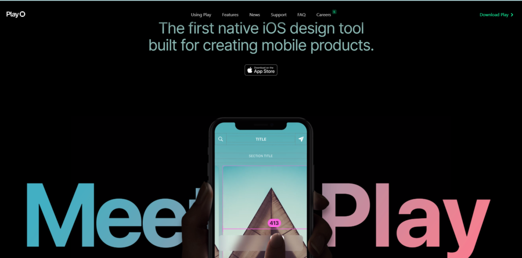
Brands like Lamborghini, Jack Daniels, Citizen Watch use black or dark tone web design to represent class, quality, and clarity. For Nike, much of its branding is done in black to render a sophisticated and classy look.
As per web design color theory, the application of black in web designs needs to be practiced with caution as its associations are conflicting. For example, it has a corporate look yet an edgy appeal. It looks formal yet has a traditional charm. Plus, this color is associated with death, suffering, darkness, fear, and evil in many cultures. Using too much black can end up dominating your entire website design.
Since black is considered one of the most sophisticated colors, it is ideal for websites dealing with luxury items of high value. Apart from its use in high-end eCommerce websites and the ad industry, black also works great for cosmetics, fashion, and any web design that wishes to add an elite and unique sense to its products.
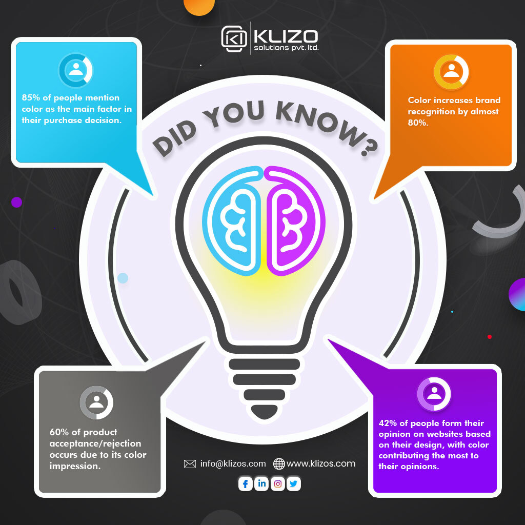
Confused about how to choose color combinations for a website? Then hire professionals! But wait, don’t end up paying money to get a website that looks like others!
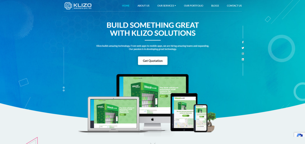
Contact us, Klizo Solutions, for outstanding website design services and get a unique and attractive website that not only stands out from your competitors but also best represents your business. Our web designing experts craft designs that are soothing to the eyes and effective in driving conversion. We make sure that your online presence has the website colors that attract, engage, and help to convert.
Remember, the right website design with the right colors is crucial for creating a good impression on your audience, nurturing leads, and increasing conversions. So, don’t wait and fret. Get one for your online business now!
Previous article
Meme Marketing: 10 Reasons Your Business Needs Meme Strategy!
Joey Ricard
Klizo Solutions was founded by Joseph Ricard, a serial entrepreneur from America who has spent over ten years working in India, developing innovative tech solutions, building good teams, and admirable processes. And today, he has a team of over 50 super-talented people with him and various high-level technologies developed in multiple frameworks to his credit.

Subscribe to our newsletter to get the latest tech updates.