


A website that tickles the humor chord in our brain, automatically creates a smart impression in our minds, right? Good humor often makes us, the users happy and lets us enjoy a good laugh at times. Otherwise, things might become pretty boring!
Yes, humor initiates smiles and that’s what makes it so important in our life as well as in UX design. A website sans humor is like a Christmas tree without x-mass lights.
Humor in UX design simply adds more meaning to your website and helps leave a positive impression on the users’ minds.

Source: Blizzard Entertainment
Does your web design desperately need that little pinch of humor to transform it into an engaging website from a dry and dust boring one? Then check out these easy ways you can use humor in UX design and make it more fun, humoristic, and of course, engaging!
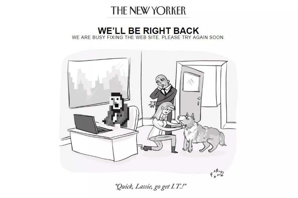
Have you always known you’re not a comedy person? Well, then there’s always the scope to learn.
You may not be George Burns or Robin Williams who probably must have started cracking funny one-liners since the very moment they were born, but you can learn. Humorizing your web design doesn’t mean including humor in every line you write.
The more you’ll practice, the more your humor sense will mature and you’ll know what it takes to glue the audience to your website by using some humoristic tricks.
Imagine, you are trying to create humoristic content, but are failing repeatedly. Don’t let this failure in originality make you resort to imitation even if it seems a quick and easy way to make your UX design humor-rich.
Copying humoristic content that is already out there only makes them look devoid of comedy due to their repeated use. Hearing the same humoristic references so many times, simply make them lose all their meaning.
Instead of recycling the same old comedic concepts; spin things in your own way to give the reader something unexpected just when they start thinking that they are on a cliched path.
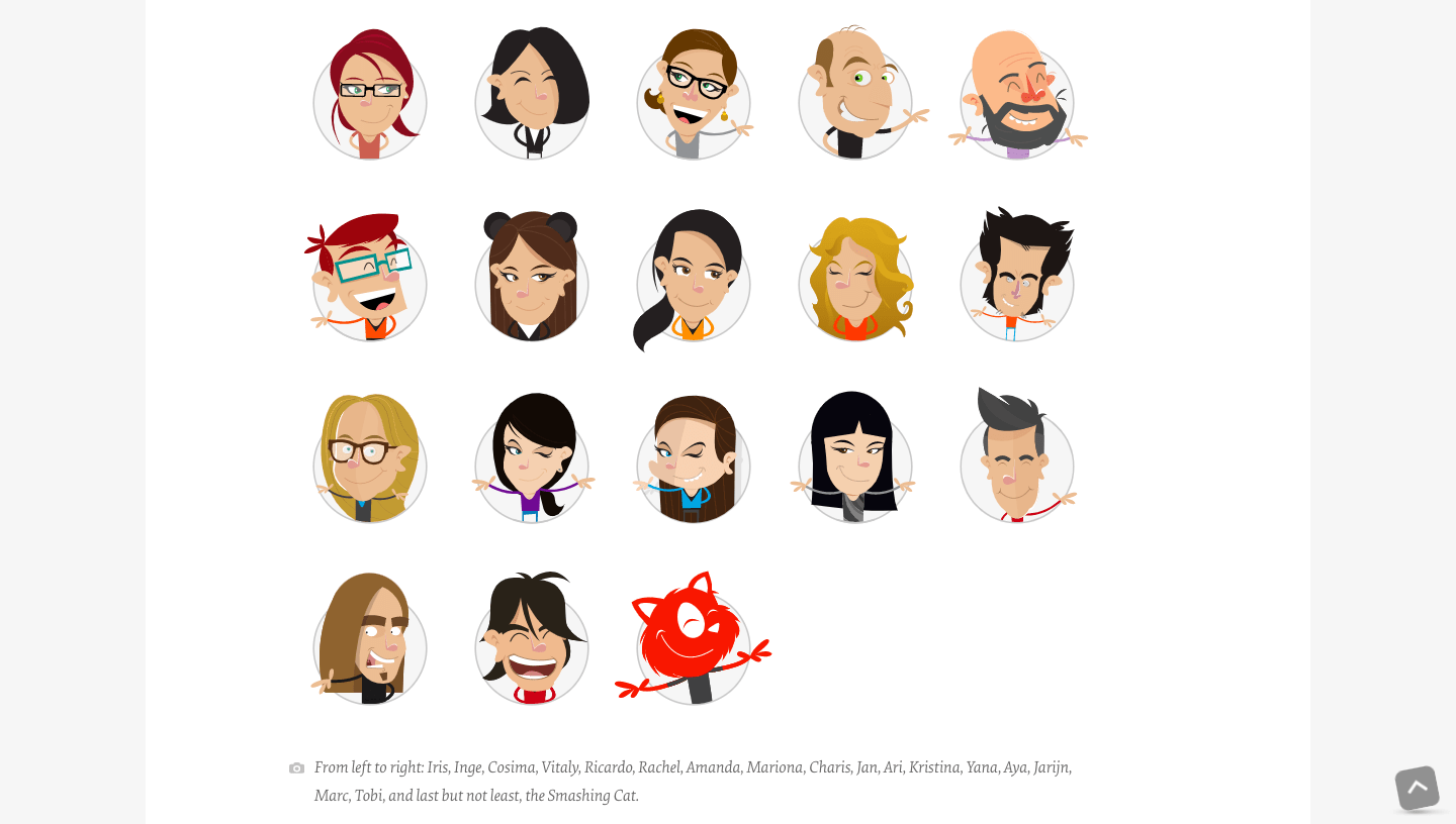
Image Source: Smashing Magazine
The ‘About Us’ page is one of the most significant pages your website has. Here, your users get to find out all about who you are, what your company does, and its culture. Despite having so much value, this page often ends up with generic UX content such as necessary information about the company or images of the people working in it, etc.
But with a humoristic and creative touch, you can convert you can make the page difficult to forget. While users tend to forget such pages as soon as they click on the close button, with creativity and a fun approach you can ensure a memorable experience for your users with ‘About Us’ and intrigue them to explore your website further.
When dwelling in the realm of humor, not being aware of the differences between being funny and absurd is a sheer crime, a punishable offense (just kidding!).
People often confuse being funny with absurdity. On a serious note, mixing up the two in a web design can cause more harm to it than any good. While a joke or a funny observation must have some basis in reality; comedy needs no reality as it can embrace the absurd.
To make your web design with humor, you must identify the common problems or traits of your audience and exaggerate those tiny pieces of truths with humor to make your content fun to read.
The content your website offers must be informative, but it shouldn’t necessarily become a torture to the eyes or worse turn into a visual lullaby! The last thing you want your website design to do is to induce narcolepsy in the viewer and serve as a one-click-cure to insomnia.
But wait, relying on just humor alone won’t get your UX design anywhere. Without info, humor isn’t of much use.
It is through the right combination of the necessary information and humor that can make your web design a magic wand enticing everyone who visits.
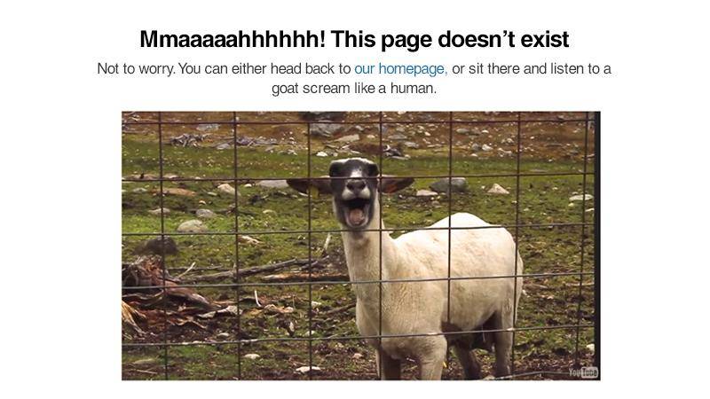
Image Source: awebstar
As they say, timing is everything; the same goes for adding humor in UX design too.
Imagine when a user on your website is having trouble with processing his payment and you keep on bombarding him with continuous humoristic pop-ups, messages, and images. The user will get simply irritated and leave your website.
Along with adding humor, the timing must be carefully done too to create the right impact of humor through your web design.
“Chaos is a friend of mine” – Bob Dylan.
Do you know you can use metaphors to ignite the humoristic appeal of your web UX? Yes, metaphors are phrases or words that are applied to an action or object to which they don’t apply.
Well, you can’t be friends with chaos as it’s no person but a state of utter confusion. Here, Dylan has linked two distinct ideas i.e. chaos and friend to make a point that he is familiar with the confusions, disorganization, and unpredictabilities of life, and even comfortable with them. Isn’t this simple yet catchy metaphoric sentence a great way to say how he likes or enjoys dealing with the complexities and confusions of life?
Metaphors can be a great way to make your audience think differently about a subject. Just remember, when applying the metaphoric language, to use familiar phrases to help the users get the joke you meant.
Another great way to add humor to your web design is by making the right use of the loading screen and loading time.
Waiting for a page to load is a real turn off. However, it’s a pretty natural thing when surfing the internet. Now what you can do is by including funny one-liners or messages or featuring jokes, you can make the process enjoyable and pleasant. Instead of showing a never-ending loading spinner with the word ‘loading’, you can add humoristic lines.
One of the brilliant examples of utilizing the loading screen to add humor to a UX design is Slack. Here when users log in, Slack cracks jokes that help the users to start the day with this business communication platform on a happy note.
Have you watched the Pixar film Inside Out or the American computer-animated comedy Ratatouille?
While in Inside Out the story is told from the perspective of the five core emotions (Joy, Fear, Disgust, Sadness, and Anger) of an eleven-year-old girl named Riley; in Ratatouille, a miniature of chef Gusteau pops up every time Remy, a little Parisian rat needs a push from his conscience, admonishing Remy to do the right thing.
Yes, it’s introducing different points of view that make the movies more entertaining, funny, and certainly humorous.
Let’s check out a more relatable example.
Say, you’re selling cosmetics where you write about pink lipstick “Try this on and you’ll love the color and smoothness of your lips.”
Not exciting; nothing new is here. But what if you write it from the perspective of your lipstick, “Hey beautiful, just put me on your lips and Oh la la, I’m gonna spread on so smoothly even your lips won’t feel they’re blushing ”.
Every Time you have the scope of including storytelling elements, present it from a viewpoint that’s not yours to make it look more peppy and funny.
Think you have lost your comedic voice? Then it’s time to revive it.
Listen to comedy podcasts, read funny books, watch comedy movies. Surround yourself with all the fun and comedy stuff; take in as much comedy as possible.
While going through comedy content, analyze them to identify what factors made an ordinary line funny? What is it that makes a movie worth enjoying and a good laugh? Recognize what’s exactly the thing in a fun painting that makes it funny.
And trust us, soon you’ll be able to distinguish between good humor and comedy from bad and bland ones.
Ever thought about exploring the potential of chatbots further in boosting your UX design by giving it a humoristic personality?
Well, since this AI software is used on websites to simulate conversations with users, the need for giving it a more human-like and warm personality has long been realized.
And here we aren’t just talking about giving it just a personality but a humoristic one; guess what wonders chatbots can do then with their improved human-like conversational aspects!
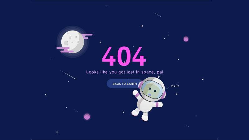
Image Source: awebstar
Another great way to grab the audience’s attention and curb their frustration when they are looking for a particular page on your website is by making the 404 Error page humorous.
It is one of the most annoying parts of a website that users come across when surfing the internet. Then why not manage their anger, stress, irritation, or whatever negativity they feel by adding humor in graphic design.
Even for other aspects of your website that visitors might find frustrating, adding humor can be the most effective medicine to reduce their stress and make them smile.
Once you become comfortable with your writing style; it’s difficult to break free and adapt to something new. But you must not be afraid to get out of your comfort zone and try something new, say, including pun, exaggeration, silliness, comparison, etc. to add a humoristic touch to your UX design.
Remember, you’re getting out of your comfort zone and actually trying something new. So, don’t lose hope, don’t feel bad, even if your attempts fail and humor falls flat! (Wait, did it just rhyme!)
Humor in design engages users and an engaging UX naturally results in happy customers and reduced bounce rate.
But wait, using humor in inappropriate situations or its overuse can send all the wrong messages to your users. So why not hire a professional who can take care of your web design and content and add a just amount of humoristic touch to it?
Yes, you can always reach out to us, Klizo Solutions, for brilliant and out-of-the-box UX ideas.
We help you to add humor to your web design and connect with your audience!
Resting the article hoping there will be more humor-filled UX design to use as a reference next time one writes about humorous UX designs.
Previous article
Joey Ricard
Klizo Solutions was founded by Joseph Ricard, a serial entrepreneur from America who has spent over ten years working in India, developing innovative tech solutions, building good teams, and admirable processes. And today, he has a team of over 50 super-talented people with him and various high-level technologies developed in multiple frameworks to his credit.

Newsletter
Subscribe to our newsletter to get the latest tech updates.
Thanks for subscribing. We'll send the latest tech updates to your inbox.